December 9, 2025

Tim Whiten at Olga Korper Gallery

The title of Tim Whiten’s exhibition at the Olga Korper Gallery is “Transpire.”

What does it mean?

After spending time at the gallery, on a snowy, darkening, late Tuesday afternoon, I decided it must mean something is happening or has happened, and these things I’m looking at, are the residue.

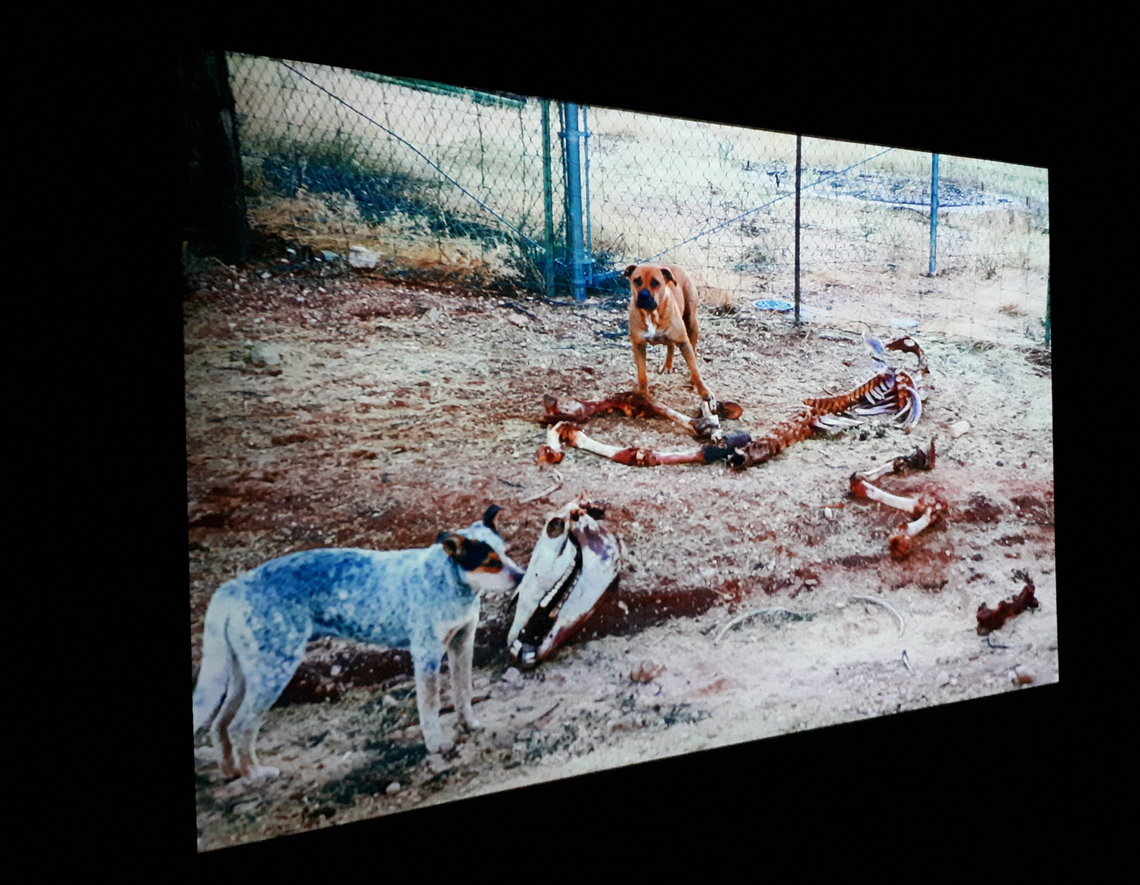
So, what is happening? Well…life. And, Tim Whiten reminds us, life is finite. Our days are numbered. Human skulls, reliquaries, coffins and remnants of the past are scattered about the show, to keep us in the right mindset.

Detail of Reliquaire III by Tim Whiten

Observing the human skull — clearly real and covered in gold leaf — near the entrance to the Olga Korper Gallery, was unsettling. Resting in a scalloped-edged, glass bowl, the grinning object appears to wear a ruff collar, like some Valesquez subject from the 1600s.

Installation view of Reliquaire III by Tim Whiten

The bowl is placed on a purple base, supported by yet another ornate object, an elaborate sconce, with a lot of brass flourishes.

This tableau made me think of the glamorous monster in Guillermo del Toro’s Frankenstein, in particular, the scene where he solemnly reads the poem by Percy Bysshe Shelley, about Ozymandias. (“My name is Ozymandias, King of Kings: Look on my works, ye Mighty, and despair!)

In Guillermo del Toro’s Frankenstein the monster resembles a Swedish runway model.

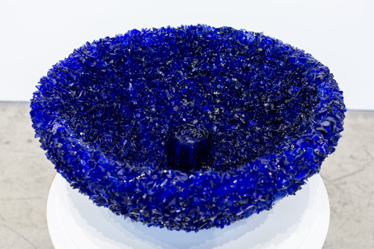
Death imagery is everywhere in this exhibition. An object resembling a house rests on the floor, bristling with crushed cobalt blue glass. It has walls, and a peaked roof, and a chimney, but there is no entrance to this house, and there is no exit. Aha, it’s a coffin. And it’s closed.

Respite by Tim Whiten

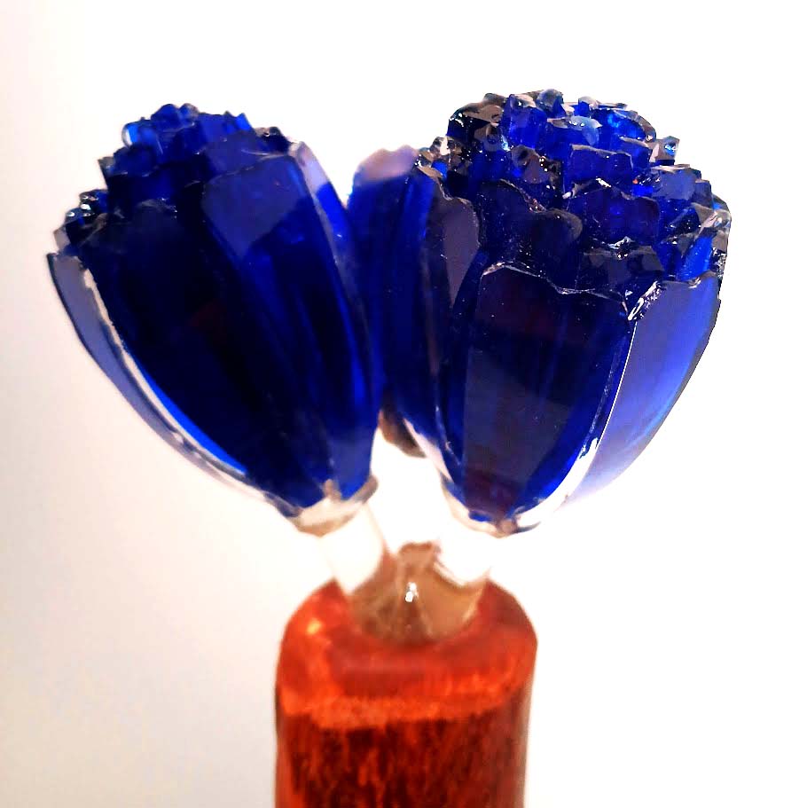
The piece below is a corn broom, coated in glittering, blue light. It’s a humble object, possibly once owned, used and touched by a departed presence and now, elevated to the status of a spiritual relic, a tangible memorial.

One, One, One (3) by Tim Whiten

The cobalt blue that Tim Whiten uses throughout the show is deep and radiant.

Detail of Stave by Tim Whiten

In many cultures, deep blue, has significance. The Turkish Nazar Boncugu (Evil Eye amulet), for example, is a talisman that can protect against evil spirits.

 The nazar boncuğu is most often used in a glass bead that is pinned on the clothing of children or hung on walls of buildings or inside of cars or other possessions to protect them.

In Catholic churches the Virgin Mary is depicted in blue glass as the pure and tranquil “light of heaven.”

The Virgin Mary in the stained glass window at Chartres Cathedral

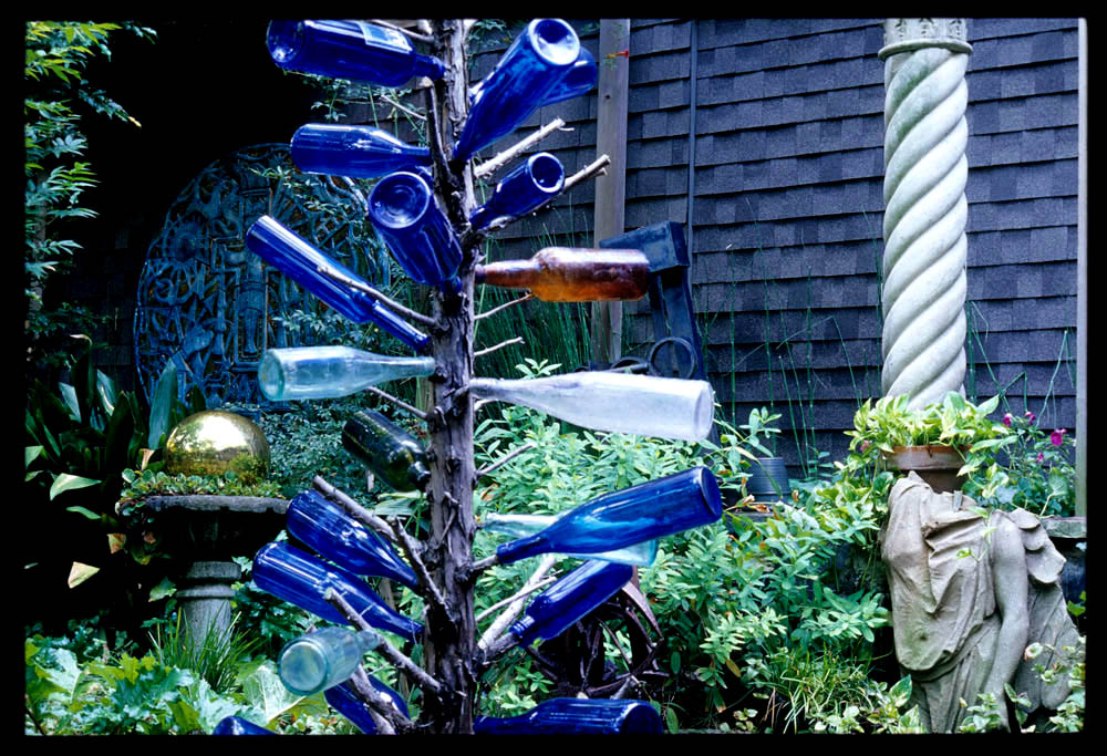
In Africa, deep blue glass was used to mark graves. Enslaved people brought this tradition to the United States.

“When African slaves arrived in the U.S., they created bottle trees from dead trees or large limbs next to their quarters and adorned them with glass bottles scavenged from garbage piles,” Doreen Howard wrote on Almanac.com. “Blue bottles were coveted, because they repelled evil and trapped night spirits to be destroyed by the rising sun. Many Milk of Magnesia bottles ended up on trees!”

“The Southern Legend of Blue Window Panes” by KellyKazek.com

Bottle trees are used to honor the dead, with blue bottles capturing the energy and memories of ancestors in a beautiful and meaningful way.

Blue is also linked to deep meditation, spiritual awakening, and a connection with higher realms. And, in this show, the objects and the sizzling blue, not only refer to death and decay. They also provide an escape to the infinite, manifest in portals, flying carpets, spiritual secrets, and meditative drawings.

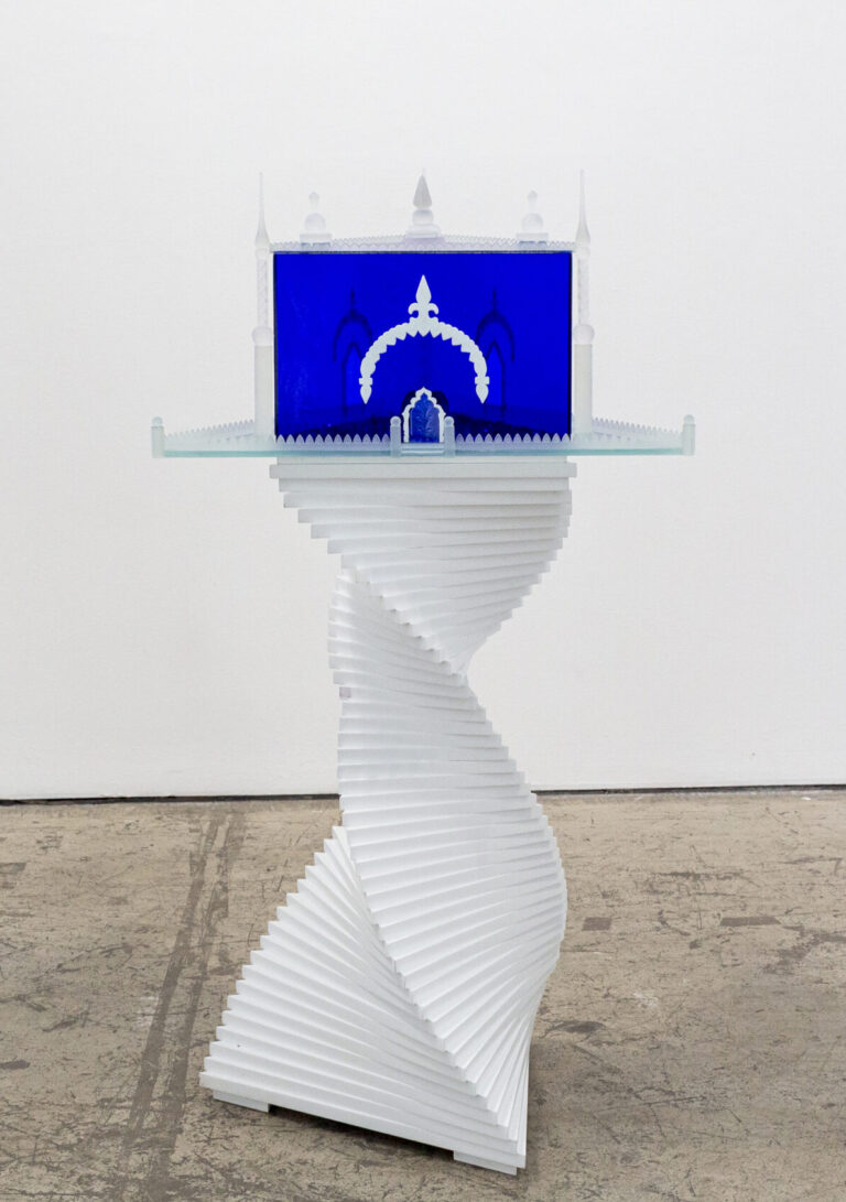
A twisted spiral staircase leads to another house. This one is an exquisite, etched glass temple It has a slightly open door. It is nearly vibrating with vivid blue light.

Spirit House by Tim Whiten
Detail of “Spirit House” by Tim Whiten

The shape of a book is composed of milky, etched glass, and within is cobalt coloured glass. So maybe the blue glass is knowledge and knowledge is light?

Book of Light II by Tim Whiten

I was informed that Tim Whiten chooses not to call himself an artist. He identifies as a maker of cultural objects. I’m not sure what the difference is. To me, the obsessive exploration and experimention, and the unique and beautiful objects he creates, are very much in line with notions of the contemporary artist.

Some of the drawings make me think of Process Art from the 1960s and 70s. Just picturing how they had to be made makes me nervous. Tim Whiten would have to be walking a meditative tightrope to create these flawless images.

Saying His Name, Beyond Fire, Water, Cloud-All, Portal by Tim Whiten
Saying His Name, Harmonics II by Tim Whiten

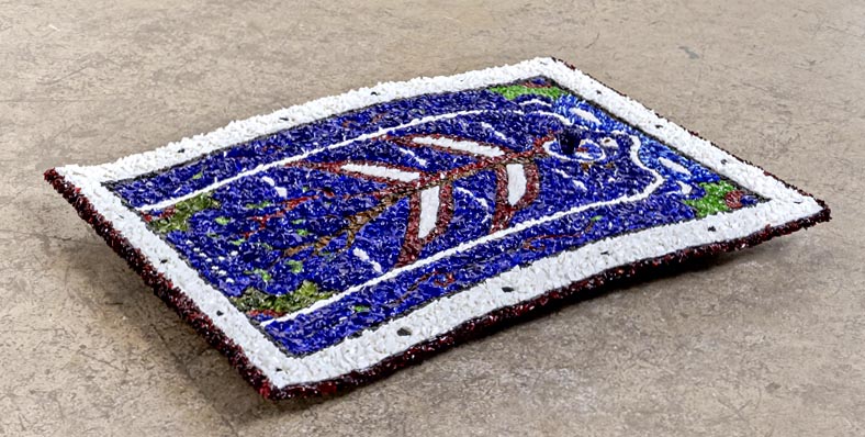
One of my favourite pieces in the show is displayed on the floor, like a colourful, molten carpet. But it’s not quite flat on the floor. It is slightly elevated and arrayed as a very subtle S-curve. Yes, it appears to be flying!

Search Reach Release by Tim Whiten

March 19, 2025

Yann Pocreau “The Lapse in Between” at Division Gallery

Yann Pocreau is a photographer who is not really into taking pictures. In his show at the Blouin Division Gallery, he seems so over it: the pointing and clicking to capture a moment in time. In fact, you get the feeling, looking at much of the work of Yann Pocreau, that he has decided there are more than enough photographs in this world.

“A Light Shift 01” by Yann Pocreau

Yann Pocreau often uses found imagery — maybe he rummages through boxes of old snaps and negatives at vintage purveyors — and then he adjusts. He crops what he finds, blows it up, prints on reactive surfaces, floods with zones of subtle colour, double exposes, amplifies flaws and creases.

Detail of “les décalages 01-06” by Yann Pocreau

The result is a tension between form and content that hovers insistently in an appealing and unresolved push and pull. The absence of context creates a new kind of object, simultaneously empty and full of meaning. The piece shown above, for example: What is it all about? Are the family members triumphant survivors of Europe in ruins? Or, are they contented boaters on Lake Simcoe, heading to a summer of cottage renovations? Are the embedded brass diagonals defining the creases of a treasured snapshot — carried for years by someone — honoring a single happy moment prior to disaster? Or, are we shown the brass lines to emphasis the powerful, pictorial composition?

Installation view of “les décalages 01-06” by Yann Pocreau

The title of the artworks above is “les décalages.” The word “décalage” means shift. (“Découpage” is something else entirely. Don’t mix it up.) Lacking context, meaning shifts, gaze shifts and attention shifts.

“The found landscapes (stained views” by Yann Pocreau

The “found landscapes” above are washed lightly with a pale sepia. Otherwise, they are basically unaltered. There is a certain nostalgia inspired by these pictures, and an innocence around imagery. They make me think about family rituals of my childhood, where film was developed, following an outing or vacation, and the snapshots — all of them, no matter how banal — were carefully mounted and labeled in a oversized photo album with a thickly padded cover.

“The lapse (the pool)” by Yann Pocreau

No amount of Photoshop editing or Instagram filters could manufacture this pair of images so rich in narrative potential, and embodying the brief summer of adolescence.

“A light shift 05” by Yann Pocreau

Other works are printed on surface so gleaming, slick and metallic that the original image is impossible to discern (as above.)

“Serendipity” by Yann Pocreau

One of the pieces, titled “Serendipity,” above, is composed of six brass plates under plexiglass. Who knew that brass could be so dense and luxurious?

When brass corrodes, it can undergo dezincification, a process in which zinc is lost and copper is left behind. Mild dezincification may simply cause a cosmetic change, namely, the colour of the surface turning from yellow to pink, but severe dezincification can lead to the weakening of brass and even its perforation. 

— Preventing and Treating the Dezincification of Brass – Canadian Conservation Institute (CCI) Notes 9/13

A slight, shifting glimpse of fushia, emanating from the painted backs of the copper plates, is caught in the plexi. Maybe we are being reminded of the potential for dezincification?

Detail of “fantasme colores – tropicalia” by Yann Pocreau

In a small room at the far end of the gallery were some examples of earlier work by Yann Pocreau. In this tropical dreamscape (above) the image content is a set up for the depiction of light and colour, and the evolution of the work of this artist.

Yann Pocreau “Toward the Light” at The Image Center (Toronto Metropolitan University)

In his show at The Image Center Yann Pocreau moves even further away from what we think of as photography and slips into a kind of reverie on light itself. Subjects disappear entirely and only light is captured and admired.

“Entre le bleu la nuit: Cyanotypes exposed with lunar and solar light (9.5 hours and 45 minutes)” by Yann Pocreau

In this composition in shades of blue, Yann Pocreau uses an early percursor to photography: the cyanotype, in which various iron compounds are exposed to light and fixed with water. (Cyanotypes were used to create industrial blueprints up until very recently.)

“Les Plates Aveugle” (The Blind Plates) by Yann Pocreau

“The Blind Plates” is described as an “inkjet print with applied gold leaf.” In this case it seems irrelevant to use photography at all. It could be a minimalist painting. Why not?

Detail of “Reconciliations (Spectrums)” by Yann Pocreau

The image above was printed on silk. It shimmered very slightly when a passing viewer created a nearly imperceptible breeze.

Installation view of “Lumière 01” by Yann Pocreau

The gallery is dark and the sound of an old fashioned slide projector adds an ASMR element to the show. The slides are simply layers of light and go to the heart of this dreamlike exhibition. I really wished there was somewhere to take a nap in the deserted space.

Detail of “Les Impermanents” by Yann Pocreau

A installation of “pierced cabinet cards” arrayed on an extended light table is another large piece at The Image Center exhibition.

According to Wikipedia “The cabinet card was a style of photograph that was widely used for photographic portraiture after 1870.”

These fascinating cards — pictures of individuals who lived over a hundred years ago, posed with grave formality — have been pierced to display images of stellar constellations, shining through the paper in the darkened gallery. Poetic and empathetic, this piece connects on many levels.

Yann Pocreau explains it best:

My journey over the last few years has been punctuated by exhibitions whose driving force is cosmic vertigo, this new relationship to the world and its phenomena, from the Universe to the center of the Earth. Between a simple dialogue with science, with a certain existentialism, I think and produce projects that attempt to address the macro and micro links that shape and design our environment, our way of understanding it.

— Yann Pocreau

February 21, 2025

The Culture: Hip Hop and Contemporary Art in the 21st Century, at the AGO

It is definitely fun to wander through the AGO’s big, bold show about Hip Hop. The organizers illuminate multiple forms of expression, trying to get at some central defining aspect of what is described as a “musical and pop cultural movement.”

“Black Power ” by Hank Willis Thomas

Clearly, that central something is Black culture, and the overturning of Eurocentric ideas of what can be culturally significant.

Hip Hop, in all its manifestations, may now be global, digital and corporate (absorbed and marketed so heavily, it is, like the show’s title, The culture) and yet, some unique vitality, dynamically expressed by Black, Latine, and Afro-Caribbean youth, in 1970s Bronx, endures to this day. Hip Hop continues to transform, explode and multiply, even against the backdrop of today’s bizarre political denial.

The Culture is organized around six themes: Language, Brand,
Adornment, Tribute, Pose, and Ascension.

Language

Hip-hop is intrinsically an art-form about language: the visual
language of graffiti, a musical language that includes scratching
and sampling, and, of course, the written and spoken word.

— Extracts from exhibition text

The Culture Exhibition

Language, in this show, starts with the spoken word. “Call and-response chants, followed by rap rhymes and lyrics overlaid on tracks, are the foundations of hip-hop music.” (Quote from the exhibition text.)

Music is playing at a decent volume throughout the AGO’s fifth floor.

You can check out the AGO playlist below:

“The Culture” Playlist is available on Spotify

The shows is sprawling, and some of the objects are traditional museum fare.

Art work by Adam Pendleton

The painting by Adam Pendleton (above) has an old school graffiti feel, as per language inscribed on the street. Weirdly, there is no mention of graffiti on the Pace website showcasing the work of Adam Pendleton. His visual art is included in prestigous collections around the world and often described as relating to “process and abstraction.”

“Six Bardos: Transmigration” by Julie Mehretu

More paintings in the show, like that of Julie Mehretu (above) don’t actually contain legible language, but here too, the debt to graffiti is clear. Julie Mehretu’s dealer is the Mariam Goodman Gallery and on the Mariam Goodman website we read about the artist’s “visual articulation of contemporary experience.”

I like the way this show schools us in how to look at certain art, particularly a contemporary painting like those above, i.e they are connected to graffiti.

The Brand, Adornment and Pose sections of the exhibition get a bit intertwined, in my view. They are all about how an individual uses technological communication to define themselves in the public sphere.

Snoop Dog 213 by Craig Boyko

Hip Hop has been around for a long time! Snoop Dog was once the personification of the cool, west coast version of the genre. He went on to host a cooking show with Martha Stewart, and recently performed at Donald Trump’s inauguration.

It’s hard to even remember a time when baggy sweatpants and sneakers were not worn everywhere, by everyone.

Outfit by Too Black Guys

In fact, you could walk through any shopping mall in North America and find an endless assortment of gear attributable to some Hip Hop connection. How about that hoodie I got on sale at Old Navy?

Cardi B
“Cardi B Unity” by Hassan Hajjaj

Cardi B, the reigning Queen of Rap, is the recipient of a vast number of accolades, awards, firsts, and mosts. In this photograph by Hassan Hajjaj she confronts the camera with supreme confidence, portrayed as the “international blend of music, fashion and consumer culture” that she is.

I liked the way the show approaches the matter of pose in the hip hop, particularly as it applies to the women in this arena. Endorsements are power for women, just like for their male counterparts.

Maya Jacket by Moncler

And who can forget the iconic red jacket from Drake’s “Hotline Bling” video? Apparently, the inclusion of this so-called Maya Jacket, by Moncler, in the famous video, locked in the brand’s connection to hip hop culture.

I think I prefer the more unexpected, even daring items in the show, as opposed to the merely manufactured. The piece (below) by Lauren Halsey is a good example.

“auntie fawn on tha 6” by Lauren Halsey

Composed of layers of synthetic hair, in brilliant shades, it has an intensity and power that strikes me as so of the moment and at the same time so reminiscent of some ancient adornment.

I found one piece in the adornment section shocking.

two men seated in room
“Nation” by Deana Lawson
man with dental decoration
Detail of “Nation” by Deana Lawson

This photograph by Deama Lawson contains an inset of George Washington’s false teeth, which were made from the teeth of enslaved Black people. The cheek retractor looks like a kind of torture object me, as repellant as the set of teeth. But that’s not how Deana Lawson sees it.

There is a nobility and majesty of a lot of gold that’s worn, and how it’s appropriated in hip-hop, and how I think hip-hop actually channels ancient kingdoms.

— Deana Lawson, exhibition notes

Ascension

And, of course, you can’t talk about Hip Hop without mentioning the deathiness that hovers on the sidelines and occasionally takes center stage.

“Street Shrine 1: A Notorious Story (Biggie)” by Robert Lugo

This funerary urn featuring a graphic depiction of the Rapper Notorious BIG captures the glamourization of violent death that has haunted the world of hip hop.

Biggie Smalls was murdered in 1997 at the age of 24. According to Wikipedia, Wallace’s funeral was held at the Frank E. Campbell Funeral Chapel in Manhattan on March 18. There were more than 350 mourners at the funeral, including Lil’ Cease, Queen LatifahFlavor FlavMary J. BligeLil’ KimRun-D.M.C.DJ Kool HercBusta RhymesSalt-N-PepaDJ SpinderellaFoxy Brown, and Sister Souljah.  David Dinkins and Clive Davis also attended the funeral.  After the funeral, his body was cremated at the Fresh Pond Crematory in Fresh Pond, Queens, and the ashes were given to his family.

February 28, 2024

Judy Chicago: HERSTORY at the New Museum, NYC

In one of the pieces from her massive retrospective at the New Museum — covering sixty years of art making — Judy Chicago invites us to consider a simple question: What if Women Ruled the World? The responses are compiled in a sprawl of hopeful texts, manifest in needlework, that most feminine of forms.

“There would be no wars.” “The Earth would be saved by humanity instead of being destroyed by it.” “The first step would be to abolish gender norms and deconstruct the entire hetero-patriarchal, racist and classist system that surrounds us.” “Not one mass shooter in the US was female.” “There is no need for violence when we use our hearts.”

In anyone else’s hands this piece might come off as naive or reductive, but there is something about Judy Chicago’s method — what she refers to as “call and response” collaboration — through which she is able to harnass an outpouring of honesty from many participants. The result is that the artwork has a powerful impact. It is urgent and exciting.

Installation view of “What If Women Ruled the World” by Judy Chicago
Detail of “What if Women Ruled the World” by Judy Chicago

This is a big show, going all the way back to painted car hoods Judy Chicago produced in the mid sixties.

Installation view of Herstory by Judy Chicago

And then there were the wonderful smoke performances from the seventies.

Immolation by Judy Chicago

But these early artworks are not the reason for Judy Chicago’s giant retrospective at the New Museum.

“Herstory” will showcase Chicago’s tremendous impact on American art and highlight her critical role as a cultural historian claiming space for women artists previously omitted from the canon.

New Museum description of Judy Chicago: Herstory

It is this role as a cultural historian which Judy Chicago fully inhabits in her artwork called “City of Ladies.” The piece is a show-within-a-show in which nearly ninety artworks by notable women from history are on display.

Installation view “The City of Ladies” by Judy Chicago
Hilma af Klint, Group IX/UW, The dove, no.2 (1915) from “The City of Ladies”
Gluck (Hannah Gluckstein), Portrait of Miss E.M. Craig (1920) from “The City of Ladies”

In an interview about “The City of Ladies” Judy Chicago often mentions a certain “Christine.” It took me a while to figure out she meant Christine de Pizan, who wrote “The Book of the City of Ladies” in 1404. Christine de Pizan lived from 1365 to 1430 and is thought to be the author of some of the very first feminist pieces of literature.

From compendium of Christine de Pizan’s works.
Shows the author lecturing to a group of men. Created in her scriptorium in Paris in 1413.

A brochure provided by the New Museum is a compendium of the women included in the show, and contains a short but detailed biography of each: Hilma af Klint, Claude Cahun, Leonora Carrington, Elizabeth Catlett, Emily Dickinson, Artemisia Gentieschi, Zora Neale Hurston…among many others.

Wounded Deer, by Frida Kahlo (1946) from “The City of Ladies”

As Judy Chicago says: “If you bring Judy Chicago into the museum, you bring women’s history into the museum.”

“The International Honor Quilt,” another “call and response” project,  is composed of 539 individual triangular quilts, produced by women from around the world. Each triangle celebrates a woman, a women’s group or a feminist issue, and together they create a joyful depiction of global female solidarity.

Installation view “The International Honor Quilt” by Judy Chicago
Detail of “The International Quilt of Honor” by Judy Chicago

Mostly global icons, like Queen Elizabeth II, are represented, but there are also lots of obscure women’s groups and a few mythological, religious, fictional women make the cut, for example: Deborah, Demeter, Eve, Isis, Nancy Drew, Persephone, Virgin Mary and, weirdly, the Loch Ness Monster.

Depiction of Nessie

Parts of the show seem too binary. Are all women good because they can give birth and all men are evil warmongers? That part of the show — despite the beauty of the massive collaborative tapestries — struck me as an illustration of the limits of second wave feminism.

Tapestry by Judy Chicago

I prefered looking at her most recent work, where she meditates on death and the climate crisis.

Artwork by Judy Chicago

But wait, the big thing, the thing I heard about for decades, the thing that defines Judy Chicago — “The Dinner Party” — was not there. It was a ghostly presence throughout, constantly referenced, but absent.

I was obliged to journey to Brooklyn, change to the 2/3 at Hoyt, past Grand Army Plaza and The Botanic Gardens, onward, to Eastern Parkway and the stately Brooklyn Museum, where Judy Chicago’s famous work is permanently lodged.

Entrance to “The Dinner Party” by Judy Chicago at the Brookly Museum

“The Dinner Party” by Judy Chicago
Detail of “The Dinner Party” by Judy Chicago

It was a long trip, but it was worth it.

April 9, 2022

Many years ago I visited the Venice Biennale and stood around under the hot, white, Venetian sun examining the paintings of Agnes Martin.

“Untitled 16” by Agnes Martin.

I remembered that long ago trip as I downloaded the absolutely free pass to the second occurence of the Toronto Biennale. And later, visiting some of the exhibitions, things felt almost normal.

The Biennale is a breath of fresh air! Wandering around in the early spring sunshine, mask free, I forgot for a short while that we are in the midst of a sixth wave.

Spring comes to Toronto

The exhibition is spread out around the city, but largely clustered in the west end, in an area dotted with construction cranes and debris. 72 Perth Avenue, the site of a future condo complex, now slated for demolition, functioned as a church before it was snagged to host the Biennale. The visitor can appreciate the raised, oratory platform and the long, vertical, stained-glass windows as evidence of its former incarnation as the Praise Sanctuary Ministry, Church of the Firstborn Apostolic and consider the connection between houses of worship throughout history and today’s grand museums; austere, white cube galleries; and newly minted biennales seeking an affordable venue.

Installation titled “Holdings” by Nadia Belerique

Nadia Belerique‘s installation, made of white plastic cargo barrels, anchors the space at 72 Perth, where it functions almost like an alter. The apparent lightness of the materials, their translucent, glowing, jewel-like coloured surfaces, which capture daylight flowing from behind, create the rooms’s focal point with an original sense of monumentality: lightfilled, colourful, airy. Within each barrel Nadia Belerique creates assemblages of found materials which may or may not refer to their original purpose.

Detail of “Hoildings” by Nadia Belerique

 What Water Knows, The Land Remember , is the title of the “curatorial vision” of the Biennale. This vision is highly idealistic, referencing the Toronto region i.e. the Great Lakes and their tributaries, and tying together ideas about ecology and the environment, inheritance and ancestry, relationships and collaboration. I did have a jarring sense of dislocation, faced with these touchingly utopian ideals and scrupulous political correctness, after a steady media diet of fear and despair: brutal war in Europe, global rise of authoritarian leaders, rage of white males, mass extinction and climate meltdown, endless Covid waves of misery. It was great to step away from all that for a few hours!

I was excited to be introduced to the work of Paul Pfeiffer. He did a fascinating, multi-media piece about a pop-star and his billions of fans around the world. In this case: Justin Bieber. He used this utterly contemporary phenomenon to explore the encarnacion-style of woodworking, which originated in sixteenth century Spain, and continues to this day in the Philippines, as a way to produce lifelike icons of religious figures.

Detail of “Incarnator” by Paul Pfeiffer

The artist named Aki Onda created a piece that had an uncanny resemblance to so much work that went on in the seventies. I really like looking at outdated technology, particularly from the seventies and eighties, so his piece called “Nam June’s Spirit Was Speaking To Me,” was a hit for me. The text that accompanies the piece, an oversized booklet, describes the artist’s ongoing attempts to channel Nam June Paik through various garbled radio broadcasts he chances upon.

“Nam June’s Spirit was Speaking to Me” by Aki Onda

Scanning through the station, I stumbled upon what sounded like a submerged voice, and began recording. I concluded this was Paik’s spirit reaching out to me.

Aki Onda, from the booklet “Nam June’s Spirit Was Speaking to Me”

It’s hard to know if Aki Onda is just relating his experiences earnestly, or not. I too have heard strange, submerged voices on the radio, from time to time.

In the gallery. the sound was very low, almost inaudible, but you can listen to Aki Onda’s piece on You Tube.

Lingering at the exhibition made me think that the fact that it takes place in a former church possibly influenced the curators decisions. Many of the pieces referenced spirituality, liturgical items or connections with deceased beings or those of distant generations.

For example, Andrea Carlson shows a sculpture and huge painting, referencing “Man Mound,” which is a 214-foot-tall earthwork in Wisconsin, dating back to between 600 and 900 BC, when it functioned as a burial and ceremonial site.

Detail of Painting titled “Cast a Shadow” by Andrea Carlson

The painting, which is immense, composed of numerous panels, and painted in a joyful mash-up of styles, appears to contain many messages, laments, pleas and warnings from the beyond, or the distant past, or just elsewhere.

Detail of sculpture by Tanya Lukin Linklater titled “Held in the air I never fell (spring lightness sweetgrass song”

Tanya Lukin Linklater‘s sculptural piece has many components. I was very attracted to the drapped scarves that hung from the ceiling, which in keeping with the theme of this show at 72 Perth Avenue, appears to reference liturgical garments, tapestries and shamanistic cloaks.

Kohkom is Cree for grandmother, and for Tanya, the scarves are a way to evoke “women’s intergenerational, embodied, experiential (and sometimes land-based) knowledge.

from Toronto Biennale of Art Website

I dashed over to MOCA — apparently my free pass entitles me to a discount on coffee at the MOCA cafe — which is around the corner on Sterling. The main floor of MOCA is part of the Biennale.

It was very enjoyable to look at the installation by Maria Qamar. This artist strikes me as completely of the moment, freely moving between the worlds of fashion, art and digital stardom.

“Dhamakedar, Superstar!” by Maria Qamar

Strolling into MOCA, and Maria Qamar’s installation, I had left the spiritual realm behind at 72 Perth, and was into a version of the material now: young, glamourous and Desi!

More Maria Qamar

January 11, 2018

York University Station

The exterior view of the brand new York University subway features a graceful, winglike swoop.  It resembles a miniature Kennedy Airport and has the same lightness and fluidity as that iconic structure, which was designed by Eero Saarinen in 1962.

YsubwAY

View of York University subway from AGYU on cold and rainy afternoon.

The new station, which is literally right across the street from the Art Gallery of York University (AGYU), was a collaborative design effort between Foster + Partners with Arup Canada.  Seen from outside, the station has a lovely, rather modest scale.  It’s when the rider descends, or ascends, that the station reveals majestic curves, plunging light sources, grandly sloping glass walls and dramatic stairways.

YSubway2subway3

Subway4

Making an entrance at the new York University subway station.

It’s capacious, filled with light and air and it is beautiful!

Apparently the vision for the new subway line started to take shape more than 30 years ago.  What was happening way back then, in Toronto in the mid 1980s?  One thing: getting to York University was a hassle.

Postcommodity at AGYU

postcommodity

Postcommodity at AGYU

Because I arrived early  – whisked effortlessly upward, upward on the stunning new Line 1 extension – to AGYU, I was able to join the volunteers for the pre-opening stroll through the exhibition by Postcommodity.

Two of the artists who make up the collective were present, and they spoke about their work, explaining in particular the torturous relationships between the US Federal border patrols, the Mexican and Latin American migrants, and, the drug cartels, and how those relationships play out along the border.  Surprisingly, the artists expressed a stoic optimism about the situation, viewing the land itself as infinitely more powerful than the various frontier guardians and extant border walls.

Video of installation by Postcommodity (similar installation is currently at AGYU)

Looking at the artwork however – and experiencing the audio component, which is a major element of the show – did not exactly inspire optimism but rather evoked sensations of disorientation, uncertainty and dread.

guardiandogs.jpg

Artwork by Postcommodity

There is a lot of empty, dark space in the AGYU show.  The central room is filled with sounds – whispers and incantations – that dart about, now on your shoulder and then across the room. There is a sole projected photograph, shown above.

The tour group was asked to think about the symbolism contained within this photograph.  We viewed the  horse carcass, unflinching dogs, fence, bleakness, neglect, loneliness, general ghastliness.  (The horse as “symbol of colonialism” was mentioned but that, to me, is a stretch.  The horse is a symbol of so many things.)  We did not need to think about it too long.  It’s immediately clear.  This is a tough place to survive.

Below is another depiction, unrelated to the Postcommodity show at AGYU, of a border and hostile environment.

Emerson border

Approaching Canada US border at Emerson, Manitoba

July 4, 2015

I am elated to be recovered from at least a month of labyrinthitis and to stroll up the Rail Path to Miller Street, in the intoxicating heat of this Saturday afternoon in July.

Katzman Contemporary

Part Time, Deep Time by Meghan Price

First let’s think about textiles (domestic, temporal, decorative, familial, utilitarian and in the realm of craft; the human story told in placemats, dresses and rugs) and now geology (just the opposite, encompassing the study of the Earth, the solar system, nearly incomprehensible time frames, confounding forces, speculative theory; a trail of continents, boulders, pebbles to puzzle over.)  In her exhibition at Katzman Contemporary, titled Part Time, Deep Time Meghan Price investigates this unlikely pairing and comes up with some fresh and unpredictable objects and images that seem to allude to the groping for understanding of some deep questions through the humble, practical arts.

MaghanPrice-11

Metamorphic by Meghan Price

MaghanPrice-13

Detail of Metamorphic by Meghan Price

I really liked looking at Metamorphic, the sculpture shown above.  The artist hand-stitched geological markings onto paper to create an embroidery of a massive boulder.  The manifestation of this eccentric idea is bold and exciting.

Meghan Price takes her knowledge of textile skills into new territory.  She weaves wire, layers and folds it, literally bastes it to rocks.

price-17

Detail of Erratics by Meghan Price

MaghanPrice-19

Detail of Wire by Meghan Price

MaghanPrice-6

Installation view of Stratigraphy by Meghan Price

In her piece Stratigraphy Meghan Price creates a sculpture reminiscent of a typical geologists core sample, except this one is made of screen printed fabric, variously patterned and compressed, and looking quite a bit like a towel display at Pottery Barn.

mprice_stratigraphy_web_5

Detail of Stratigraphy by Meghan Price

I recently saw an exhibition at the Textile Museum of Canada called Artist Textiles.  A number of the most familiar artists of the twentieth century (Warhol, Picasso, Dali, Matisse) were included.  In every case the artist textiles were images by these extremely famous artists printed onto fabric.  The same images could just as easily been been printed onto bookbags or mousepads.  It was like the gift shop took over the Museum.  Meghan Price, on the other hand, goes so deep into this domain that it becomes abstract, open ended and encompassing all.

EX-2015-Artist-Textiles-03

Number Please? scarf by Salvador Dali


Thin Air, Bright Light by Yi Xin Tong

While walking around the gallery I learned that Yi Xin Tong was born in Antarctica.   I couldn’t help wondering if his short films (stop action GIFs), made from found imagery of various situations playing out in a dramatically barren, snow and ice landscape, were related to this fact in some way.  Do these silent, dreamlike tableau equate to memories of early years in the deepest south?

Tong_Install+5

Installation view of short films by Yi Xin Tong

01_how_to_capture_penguins

How to Capture Penguins by Yi Xin Tong

The films, some only a second or two in length, some with a single image which flickers slightly, read as mysterious messages from another time and a stark realm.  I like the efficiency at work here, the way so much content and formal nuance is packed into these succinct artworks.

Yi Xin Tong’s carved inkjet prints on paperboard share that sense of ‘less is more.’  Quite literally, in this case, since the artist excavates the boards, tearing out the former depictions to create mysterious and playful new images upon an expressive and unifying ground of swirling striations and gouges.

5-1

Piano Factory II by Xi Yin Tong

3

Arwork by Yi Xin Tong

February 28, 2015

The Dufferin bus was suddenly drenched in a unfamiliar phenomenon: Sunshine!  We looked around, stunned, and blinked weakly.

MKG127 – Liza Eurich

What initially attracted me to drop by MKG127 and take in an exhibition by Liza Eurich was the appealing artist’s statement on the Gallery website. See below (reproduced in its entirety):

Eurich will be presenting work that: emphasizes negative space, is hollow, has a faceted surface, contains other work(s), is concealed, is layered, has multiple components, is not a multiple, is like a drawing, incorporates text, is stationary, has reticent characteristics, is monochromatic, uses straight lines only, references Agnes Martin, is fragile, consists of more than three materials, is made of ceramic, was built, is freestanding, requires a plinth, uses keyholes, uses a French cleat, is in its third iteration, is in a series of three, is positioned adjacently, is architectural, references something from an Ikea catalogue, is functional, is recognizable, does not resemble an animal, was almost omitted.

Based on this text I anticipated hardcore post-conceptual, neo-minimalist works but something about the slightly off-kilter, cannily understated writing assured me it would be fresh, distinctive and droll.

view1-en

Installation view of Liza Eurich exhibition

Just as the writing suggests, the exhibition, titled Either a New or Existing Character, is a collection of unique items with various attributes: is wood, is thin, is freestanding, hangs on the wall, painted white, stained and…. so on.  The art works are diverse but nearly all could be described as spare, restrained, subtle, precise and strangely reminiscent of some carefully crafted maquette or fragment of a maddening Ikea puzzle that just will not fit together.

The delicate piece below is fitted with what could possibly be a tantalizing scrap from an instruction manual.

Eeeee1-en

Eeeee: not for placing by Liza Eurich

I really liked the cool, deadpan industrial look of Liza Eurich’s larger sculptures.  They are so perfectly suited for some mysterious function.  Are they a tribute to the Scandanavian juggernaut on the Queensway?

standingrack-en

Freestanding two sided rack by Liza Eurich

shelving-en

Shelving: six additions by Liza Eurich

Occasionally Liza Eurich adheres some murky graphics to her sculptures.  Apparently these images are from a single book found by the artist.  Possibly medical or antique technological illustrations, these random bits of imagery, placed with such constraint and exactitude, add to the sense of an architectural model but one that references time and atmosphere as well as structure.

3levels1-en

3 levels, pedestal base by Liza Eurich

2components2-en

Two components, layered rectangle by Liza Eurich

Resting on a pedestal is an artpiece initally reminiscent of a vessel of some kind.  It’s made of deep black broken tiles which dip and swerve to encase a naturalistic form.  Mishapen, gnarly, almost expressive, the soft black tiles absorb and reflect light like a big lump of bitumen.

facets-en

facetsdetail1-en

Facets by Liza Eurich

Liza Eurich keeps her ideas on simmer and doesn’t give away too much.  I left the gallery with an appreciation for the subtle feeling of hesitancy and tension that was created.

February 20, 2015

How about those grimy ice hillocks that are lining the streets of Toronto?

I have to keep reminding myself that civilization is not breaking down.  It’s just winter.

Koffler Gallery – Kriistina Lahde

The Koffler Gallery, located in Artscape Youngplace, is the site of an exhibition by Kriistina Lahde titled ULTRA-PARALLEL.

I arrived to see the show in a completely winterized getup. The young woman at the desk immediately sprang into action and rushed up to meet me as I entered the gallery space. It took me a few minutes to figure out why this woman – charming and erudite – was so intent on guiding me around the show. The fact is that much of the work is delicately balanced and perishable. It could be easily destroyed by an unruly toddler ….or a viewer with fogged up dark glasses and a puffer coat. She didn’t want me to accidently wreck something.

It’s always so satisfying to see an art piece right in the middle of a gallery space. This show has a spectacular sculpture front and center. As light and airy as a dandelion puff ball the work is also structurally engrossing and culturally loaded.

20150219_161345

From a straight line to a curve by Kriistina Lahde

20150219_161411 20150219_162415

Details of From a straight line to a curve by Kriistina Lahde

Geodesic domes must have been around forever but for me they are associated with Buckminster Fuller. He discovered that triangles arranged into a sphere create structures of incomparable strength. He tried to market geodesic domes as dwellings but they did not catch on.  (Civilization is not breaking down!)

The sculpture is made of vintage yardsticks.  Each has a glowing patina and is emblazoned with the name of a long gone hardware store or house paint purveyor.  Even the name “yardstick” is an anachronism and the use of these appealing objects, once so common as to be nearly invisible, softens the piece and adds a melancholy dimension.

Yardsticks are the raw material for another sculpture in the exhibition.  This one, depicted below, glows in a delicious curve as the wooden sticks are arrayed according to hue and balanced in a swoop.

20150219_161852

Slide Rule by Kriistina Ladhe

20150219_161927

Detail of Slide Rule by Kriistina Ladhe

In fact, most of the pieces in the show are created from measuring devices: A chalk reel, surveyors tape measure, vellum, sewer’s measuring tape, and the yardsticks.  Routine, utilitarian, mundane could all be used to describe these objects.  Kriistina Ladhe uses them with grace and wit not so much to transform them as to allow their brilliant versatility and simplicity to be evident in a new context.

20150219_161721

Detail of Parallel Lines by Kriistina Lahde

chalk line

Detail of String and a Box by Kriistina Lahde

velum

Detail of Tool for Making by Kriistina Lahde

20150219_162751

Greater than, less than by Kriistina Lahde

Near the entrance to the exhibition is a mysterious circular piece of steel.  It is a depiction of a meter.   The phrase “Meter: one forty millionth of the circumference of the Earth” is etched along the bottom rim of the object.  This piece has all the marks of serious tool but it is delightfully useless.

20150219_162118(0)

One forty millionth of the circumference of the Earth by Kriistina Lahde

The concept of the meter goes back to the 18th century.  After the French Revolution the French Academy of Science selected this as the standard measurement unit in the new Republic.  It was believed to be one ten-millionth of the length of the meridian through Paris from pole to the equator.  Actually they were a bit off, which is explained in an essay accompanying the exhibition.  Currently, somewhere in Geneva, the meter is defined as “the distance light travels, in a vacuum, in 1/299,792,458 seconds with time measured by a cesium-133 atomic clock which emits pulses of radiation at very rapid, regular intervals.”  Progress, not perfection.

January 15, 2015

I walked north from Dupont on Osler and then veered left to take in some of the desolate, windswept beauty of the Junction. All was bathed in a high contrast glare on this bright afternoon in deep January.

20150115_144339 20150115_140733

Jessica Bradley Gallery

It was such a relief to be in the warm, friendly gallery space, filled with laconic poetry, as a succession of trains rumbled by outside.  The show at Jessica Bradley is called Signs & Symbols.

Work by a dozen artists is on display. The delivery methods are diverse but there is a definite coherence to the show: high Concept Art, detached and cool.

20150115_143622

Installation view of Signs & Symbols

The show got me thinking about the material manifestation of ideas and how far ranging that could be among the original Conceptual Artists: From the notion that “if it’s worth doing it’s worth overdoing,” (for example, Robert Smithson literally creating a new landscape) to instances whereby the object part of the art became less and less important until finally, poof!, it was gone (as in Sol LeWitt handing out some instructions).

In this exhibition, one end of the spectrum (the “less is more” end) might be occupied by Jason McLean who jots some practically illegible notes on nice thick paper and then frames them. It’s so deft and effortless, the way these particular text fragments powerfully capture some of the chaos and unmanageability of contemporary life.

20150115_143429

Jan 2112 by Jason McLean

(Since it is a bit hard to read I’ve excerpted a particularly appealing section below:)

loose nuts in bowl
  with kiwi &
    log on log off
      computer
         manual

Jason McLean’s poetry/sign works really well with a photograph by Geoffrey James which is hung next to it. The photograph documents a bit of signage on the exterior of The Matador. The bizarre concoction of letters on dense green paint is like a faint missive from another world, emphasizing the divide between the dull staid society where mail is delivered and the after hours parallel universe where vice and mayhem rule.

20150115_143409

The entrance to the Matador by Geoffrey James

Some of the work seems to be getting at the ineffable. Like a thick black, manufactured oval with glowing white letters by Kelly Mark.  It effectively reminds the viewer that life is short and eternity awaits.

20150115_142854

Nothing is Larger than Everything by Kelly Mark

Yes, yes….there is no time like now! I should buy a Hyundai and some cheap gas!

A piece by Robert Fones, similarly manufactured and glowing, elevates a strangely awkward command.

20150115_142947

What You Don’t See Displayed by Robert Fones

Tricia Middleton’s piece, painted in watery blues, is a quote from Nietzche.  It has a plaintive tone and makes a link between the courage to live life deeply and the by-product of that, which is intense suffering.

20150115_142910

The most spiritual human beings (Nietzshe) by Tricia Middleton

The artist Karl Holmqvist creates an ambitious installation work.  Typewritten sheets completely cover one wall and climb over a platform.  The texts share a visual similarity to the “typings” of Christopher Knowles but unlike that famous autistic artist whose pieces never waver from a single idea, this installation offers a roving commentary on such disparate topics as celebrity culture, advertising, politics, history, religion and so on.  It’s not clear if these are found texts or compositions by the author.  There are a couple of sets of headphone included as part of the installation where one can listen to what sounds like a computer with a deep, male, German accented voice reciting random words.

20150115_14310420150115_143309

20150115_143255

Untitled (MOMA) by Karl Holmqvist

Walking back down Miller Street I had a new appreciation of the workaday announcements plastered on plateglass all around me.  What were the considerations that resulted in the final form?

20150115_144955