Yann Pocreau “The Lapse in Between” at Division Gallery
Yann Pocreau is a photographer who is not really into taking pictures. In his show at the Blouin Division Gallery, he seems so over it: the pointing and clicking to capture a moment in time. In fact, you get the feeling, looking at much of the work of Yann Pocreau, that he has decided there are more than enough photographs in this world.

Yann Pocreau often uses found imagery — maybe he rummages through boxes of old snaps and negatives at vintage purveyors — and then he adjusts. He crops what he finds, blows it up, prints on reactive surfaces, floods with zones of subtle colour, double exposes, amplifies flaws and creases.

The result is a tension between form and content that hovers insistently in an appealing and unresolved push and pull. The absence of context creates a new kind of object, simultaneously empty and full of meaning. The piece shown above, for example: What is it all about? Are the family members triumphant survivors of Europe in ruins? Or, are they contented boaters on Lake Simcoe, heading to a summer of cottage renovations? Are the embedded brass diagonals defining the creases of a treasured snapshot — carried for years by someone — honoring a single happy moment prior to disaster? Or, are we shown the brass lines to emphasis the powerful, pictorial composition?

The title of the artworks above is “les décalages.” The word “décalage” means shift. (“Découpage” is something else entirely. Don’t mix it up.) Lacking context, meaning shifts, gaze shifts and attention shifts.

The “found landscapes” above are washed lightly with a pale sepia. Otherwise, they are basically unaltered. There is a certain nostalgia inspired by these pictures, and an innocence around imagery. They make me think about family rituals of my childhood, where film was developed, following an outing or vacation, and the snapshots — all of them, no matter how banal — were carefully mounted and labeled in a oversized photo album with a thickly padded cover.

No amount of Photoshop editing or Instagram filters could manufacture this pair of images so rich in narrative potential, and embodying the brief summer of adolescence.

Other works are printed on surface so gleaming, slick and metallic that the original image is impossible to discern (as above.)

One of the pieces, titled “Serendipity,” above, is composed of six brass plates under plexiglass. Who knew that brass could be so dense and luxurious?
When brass corrodes, it can undergo dezincification, a process in which zinc is lost and copper is left behind. Mild dezincification may simply cause a cosmetic change, namely, the colour of the surface turning from yellow to pink, but severe dezincification can lead to the weakening of brass and even its perforation.
— Preventing and Treating the Dezincification of Brass – Canadian Conservation Institute (CCI) Notes 9/13
A slight, shifting glimpse of fushia, emanating from the painted backs of the copper plates, is caught in the plexi. Maybe we are being reminded of the potential for dezincification?

In a small room at the far end of the gallery were some examples of earlier work by Yann Pocreau. In this tropical dreamscape (above) the image content is a set up for the depiction of light and colour, and the evolution of the work of this artist.
Yann Pocreau “Toward the Light” at The Image Center (Toronto Metropolitan University)
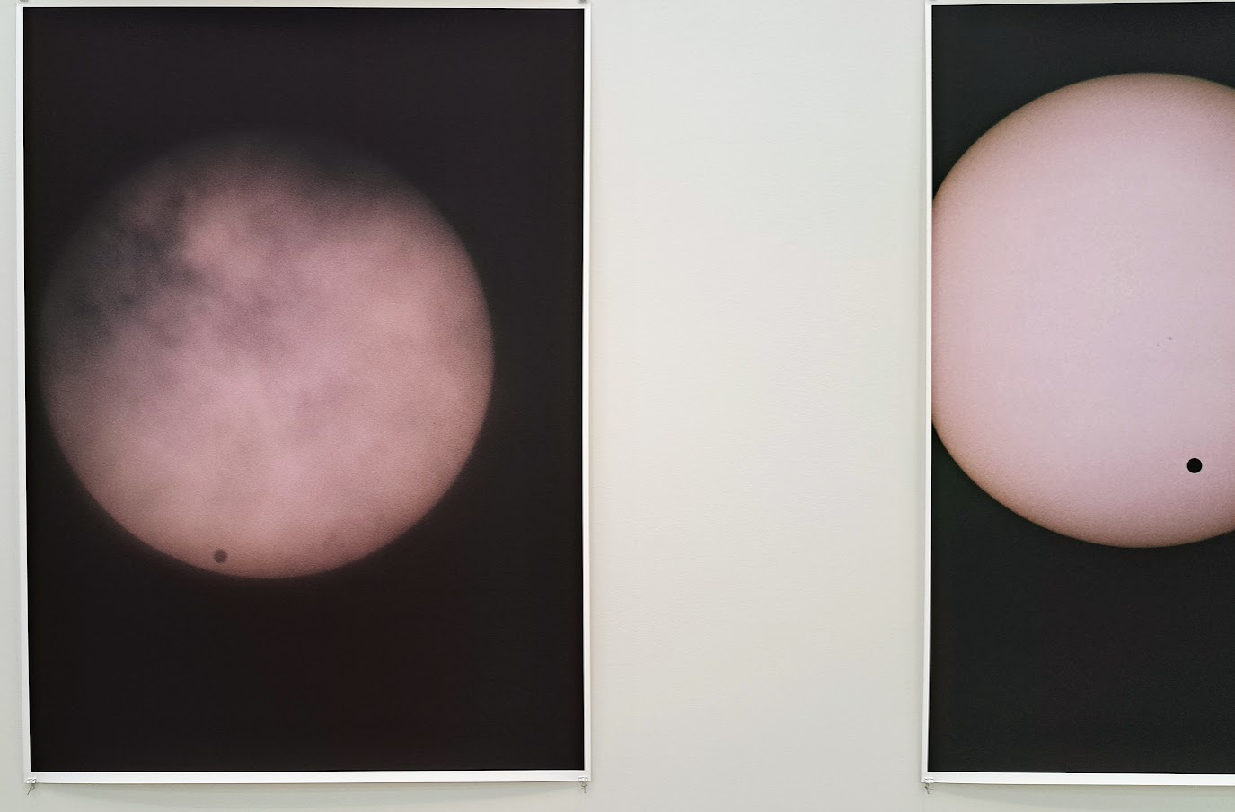
In his show at The Image Center Yann Pocreau moves even further away from what we think of as photography and slips into a kind of reverie on light itself. Subjects disappear entirely and only light is captured and admired.

In this composition in shades of blue, Yann Pocreau uses an early percursor to photography: the cyanotype, in which various iron compounds are exposed to light and fixed with water. (Cyanotypes were used to create industrial blueprints up until very recently.)

“The Blind Plates” is described as an “inkjet print with applied gold leaf.” In this case it seems irrelevant to use photography at all. It could be a minimalist painting. Why not?

The image above was printed on silk. It shimmered very slightly when a passing viewer created a nearly imperceptible breeze.

The gallery is dark and the sound of an old fashioned slide projector adds an ASMR element to the show. The slides are simply layers of light and go to the heart of this dreamlike exhibition. I really wished there was somewhere to take a nap in the deserted space.

A installation of “pierced cabinet cards” arrayed on an extended light table is another large piece at The Image Center exhibition.
According to Wikipedia “The cabinet card was a style of photograph that was widely used for photographic portraiture after 1870.”
These fascinating cards — pictures of individuals who lived over a hundred years ago, posed with grave formality — have been pierced to display images of stellar constellations, shining through the paper in the darkened gallery. Poetic and empathetic, this piece connects on many levels.
Yann Pocreau explains it best:
My journey over the last few years has been punctuated by exhibitions whose driving force is cosmic vertigo, this new relationship to the world and its phenomena, from the Universe to the center of the Earth. Between a simple dialogue with science, with a certain existentialism, I think and produce projects that attempt to address the macro and micro links that shape and design our environment, our way of understanding it.
— Yann Pocreau


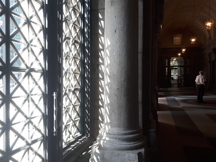
 Saint Marguerite Bourgeoys teaching her indigenous pupils in 1694 on ground belonging to the
  Portrait of Saint Marguerite Bourgeoys
 Detail of “The Prophets” by Richard Ibghy and Marilou Lemmons
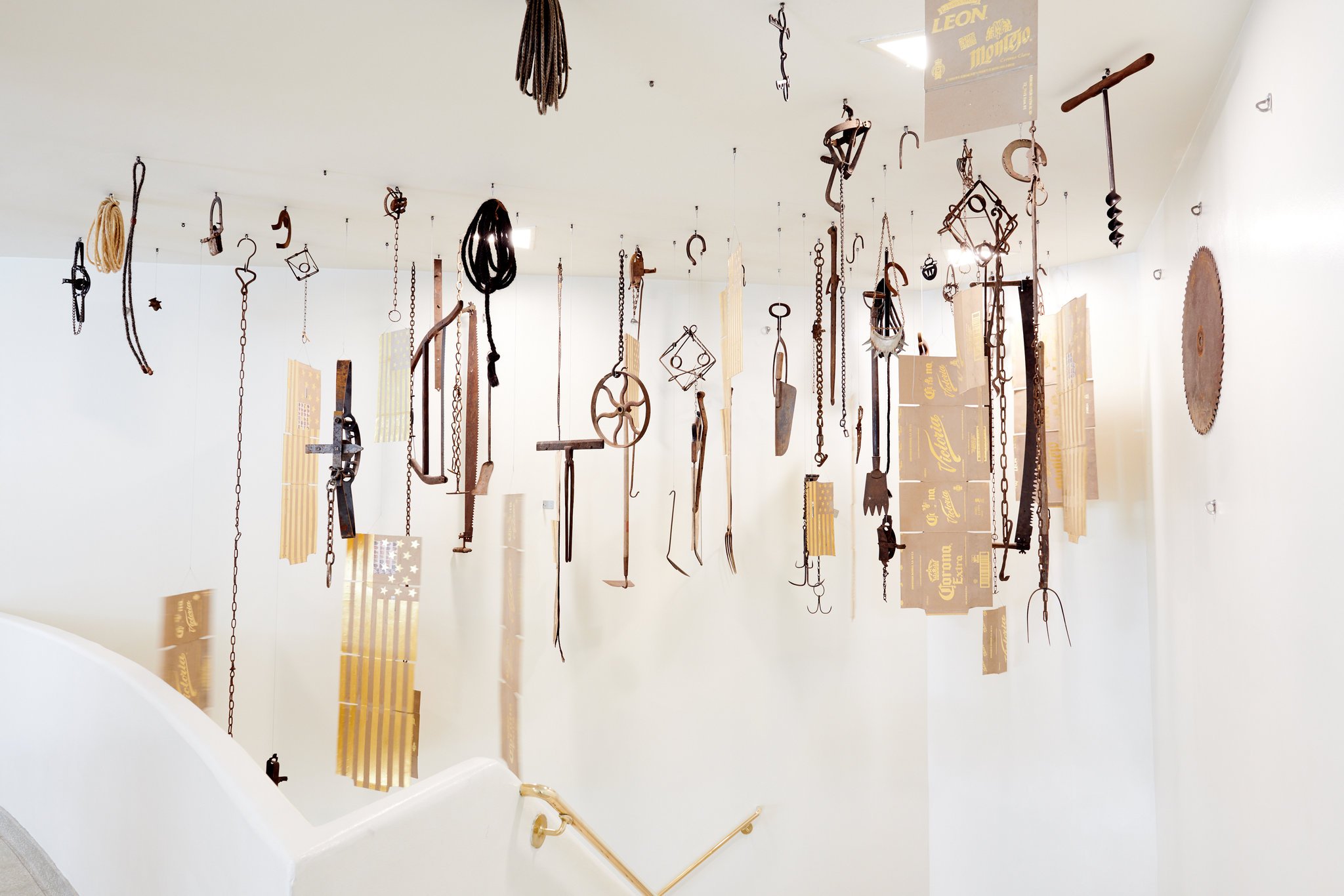
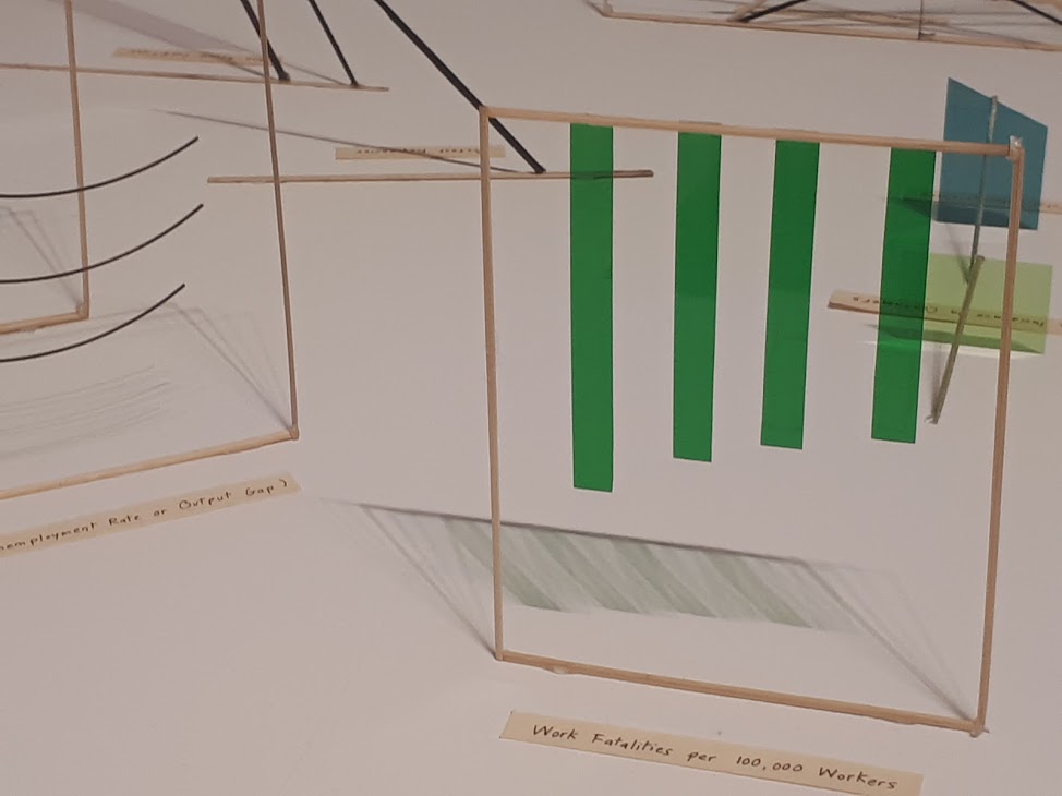 Detail of “The Prophets” by Richard Ibghy and Marilou Lemmons
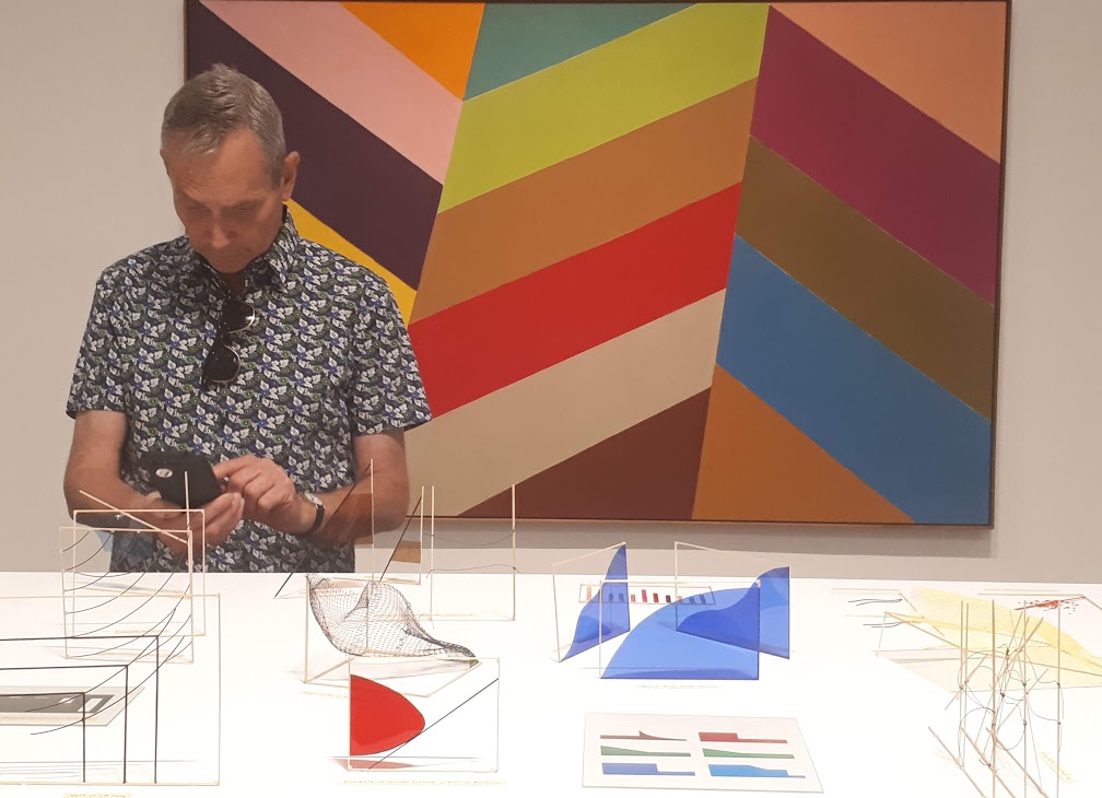 Museum goer photographing art work by Richard Ibghy and Marilou Lemmons, while standing in front of a painting by Jack Bush
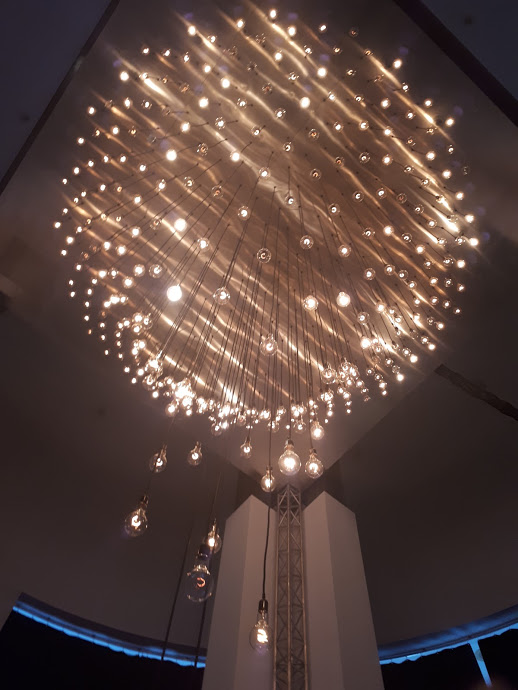 Pulse Spiral by Rafael Lozano-Hemmer
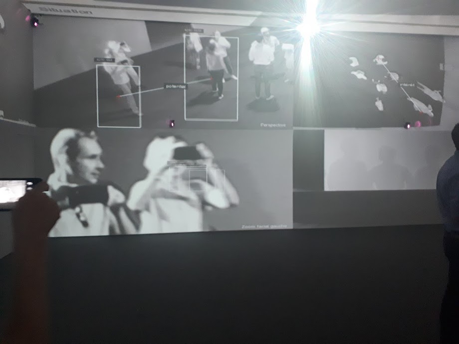
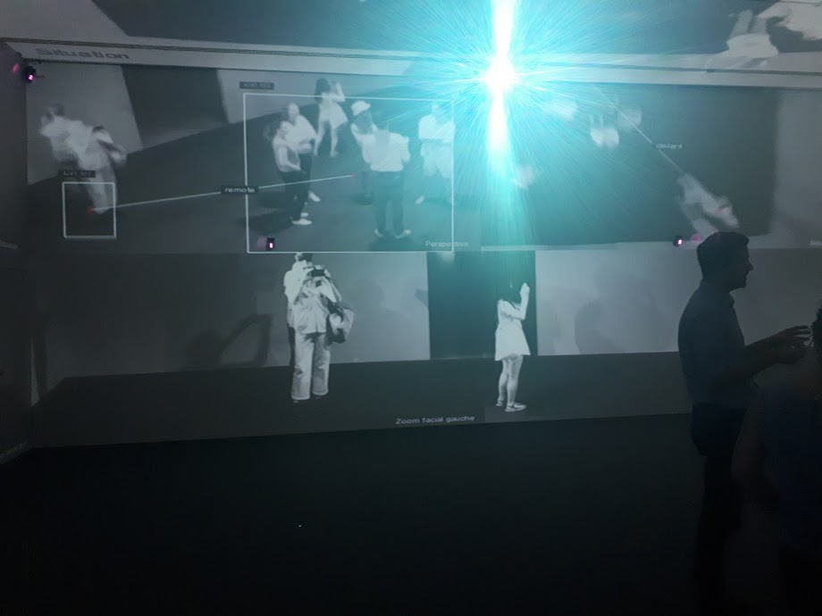 Installation shots from Zoom by Rafael Lozano-Hemmer
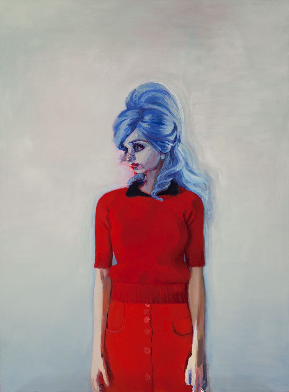 “Earthling (Red Sweater)” by Janet Werner