Today a 25 year old man was rescued by the authorities as he tried to walk from Detroit to Toronto on the ice of Lake St. Claire. He had been on the ice for a couple of days when found, improperly dressed and without a cell phone or life jacket. “He was in the beginning stages of hypothermia,” said the commander of the Coast Guard cutter who spotted him, “It took him a long time to formulate his thoughts.” This guy could not have been thinking clearly from the start. It’s March now. The sun has a new strength. Soon all this ice and snow will disappear and be forgotten.
Barbara Edwards Contemporary Art – Medrie MacPhee
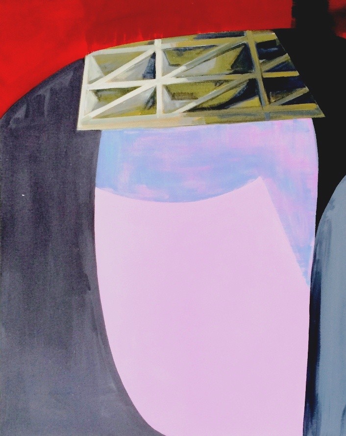
The oil paintings by Medrie MacPhee, on display at the Barbara Edwards Contemporary Art, point to a cycle of change. Awakening, destruction and renewal are quite literally the subject matter of this work, as embodied in that epic domestic event: the home renovation.

The Force of Things by Medrie MacPhee
Openings are excavated as layers of surface are ripped away. Heaps of material lie in ruins, shredded, frayed and broken. Orientation is subjective as up or down could be anywhere.

Bayou II by Medrie MacPhee
In most of the painting familiar building materials are rendered: lathing, flashing, duct work, sheet rock, even bits of copper pipe.

Detail from painting by Medrie MacPhee
These paintings of a domestic interior in upheaval bring up lots of ideas: the mayhem of war zone collateral damage, the destruction of security and relationships, psychological states of painful renewal, transition, damage, change.
I haven’t gone through a homeowner renovation but I notice that when people talk about these traumatizing experiences they invariably use the word “nightmare.” I imagine it could be nightmarish to witness the demolition phase. In most of the paintings a looming black void is present. Maybe its about a feeling of dread that must occur when the sledgehammers come out and you know there is no turning back.

The New House by Medrie MacPhee

The Look by Medrie MacPhee
Formally these paintings are so interesting to look at. They have churning quality which somehow emerges through the compositional elements being strung together with attenuated shadows, cracks and slab-like edges. In some pieces it appears the artist has used canvas like paper collage, adhering layers like a construction site patch job that adds to the sense of heaving movement.
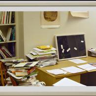
One of the most absorbing pieces is in fact a paper collage. It has a lightness and freshness that is very appealing.
.
Rummage by Medrie MacPhee
There is a Portuguese bakery a couple of doors up Bathurst from Barbara Edwards Contemporary Art. We dropped in after the show and totally obliterated some flakey, cream filled confections.