November 21, 2014


The paintings by Carol Wainio on display at Paul Petro Contemporary Art quickly drew me into their dense, tangled layers of imagery.
These paintings are so visually deep.  A dark, gnarly, ancient-looking forest landscape is the middle ground.  Far in the distance are winsome pastel vistas.  Strangely patterned birds, maybe pheasants, charge about the forest floor, heading for clearings and stone pathways through the old growth.  Numerous disparate objects, creatures, little people, symbols of all types and sometimes words are found embedded in the welter of images.  In the foreground, bold, simple line drawings and fat polka dots create a closer surface, as though we are looking through glass into another world.
Carol-Wainio-Les-Cailloux-Blancs
Les Cailloux Blancs

20141121_134234

20141121_134307

Detail from Les Cailloux Blancs

Accompanying the show, titled Dropped from the Calendar, is a long text written by Carol Wainio in which she suggests the nature of modern life has resulted in certain losses such as the creative luxury of boredom, certain notions of enchantment, reliable shared memories and rhythms of the seasons.  The phrase “dropped from the calendar” refers to the pages of traditional holiday calendars which were once reserved for personal recollections.  Are these blank pages no longer necessary since recollections are manufactured and provided for us now?

Carol-Wainio-Lost

Lost

20141121_134404

One Evening

Frequently the outline of a transparent fawn, like the familiar twinkly Christmas lawn ornament, turns up in the paintings.  Could be that Carol Wainio is connoting our feeble and sentimental link with the natural world through this image.

20141121_134653

Renderings of children, definitely from another period in history, also recur in the paintings.  For some reason I thought of the Hummel figurines my mother-in-law in New Jersey used to collect.  They seemed beyond kitsch — the height of manufactured nostalgia –  to me.  Maybe that is what Carol Wainio is getting at, i.e. that our private nostalgia has been hijacked and sold back to us.

It is a pleasure to look at these paintings which are both visually and metaphorically deep and to spend some time speculating on the connections and references within them.

In the accompanying text Carol Wainio quotes Walter Benjamin’s talking about fairy tales in the modern age: “This is how today it is becoming unraveled at all its ends after being woven thousands of years ago in the ambience of the oldest forms of craftsmanship.’   I was thinking about these ancient tales and how they helped people in perilous times when I came across an announcement about the release of some long lost Grimms’ Fairy Tales.  One of the stories is summarized below:

“Once there was a father who was slaughtering a pig in the yard,  His two sons saw him do this, and they decided to play slaughtering. One of the brothers became the pig, and the other became the slaughterer and he slit the throat of the younger brother. In the meantime, the mother was watching upstairs from a window and saw what had happened. She ran downstairs and took the knife out of the boys throat and, out of fury, she stabbed the older boy in the heart. And then she realized the baby was upstairs, and in the meantime the baby had died and drowned in the tub. She was so remorseful she committed suicide. The father, he was so dismayed that after two years he wasted away.”
Farm Boy
Hummel Figurine “Farm Boy”

November 19, 2014

We are suddenly plunged into Polar Vortex hell, again.

I hurried through the steady snow in mild panic.

Vera Frenkel at MOCCA

Ways of Telling is the name of the MOCCA exhibition of Vera Frenkel’s work. The entirety of the MOCCA plant is packed to overflowing with Vera Frankel art pieces: There’s an early video piece in the lobby, curtained off with black drapes; two different books on Vera Frenkel’s art are prominently displayed and on sale at the reception desk; both of the large exhibition spaces are filled with Vera Frankel’s video projections, installations, numerous large collages and documentation of art pieces from the past.  Here and there holes are punched right through walls so the viewer doesn’t have to miss anything.

20141119_154207 20141119_152521 20141119_150032 20141119_150425

Installation shots from Ways of Telling

An entire functioning “piano bar”, where you can actually get a drink and which contains everything (and more) that constitutes a real bar, has been constructed in one of the main rooms at MOCCA.

20141119_152818

 …from the Transit Bar

The hallway is a site for her work and if you leave through the rear exit you are obliged to pass through yet another Vera Frenkel piece.

20141119_152144

Installation shot of “The National Art Institute”

Even the bathroom contains an installation by Vera Frenkel.

20141119_152431

The most obvious constant in this plethora of output is Vera Frenkel’s voice. Throughout the galleries she can be heard everywhere. Refined, pleasant and carefully modulated this voice tells stories with an almost hypnotic quality. With uncanny intimacy and assurance the voice confides. You the listener and she the teller are well acquainted. She has definitely got your ear and she is going to tell you the whole story.

For me, coming from the West, her voice has a particular Ontario cadence, a certain lilt that is present only east of Kenora. But beneath all this self possessed Upper Canadian palaver there is determination, sometimes sorrow and often a growing rage.

In the large video projection called Once Near Water: Notes from the Scaffolding Archive Vera Frenkel explores long-standing anger directed at the greed that has defined the waterfront landscape in Toronto.  Through a complicated shaggy dog narrative she artfully discloses the facts.  Money and power win.  The lake disappears behind a grid of scaffolding.

20141119_153912 20141119_153101

Once Near Water: Notes from the Scaffolding Archive

A piece entitled The National Art Institute, Or what we do for love is largely virtual.  The posters about the National Art Institute in the exhibition baffled me so I checked it out on the web.  The piece seems to have no beginning or end.  Like some bureaucratic nightmare it has its own smug logic and lots of deadends.  Looking through the website is quite fascinating but maddening in its elusiveness.  In trying to get a grip on the dystopic near future Vera Frenkel seems to be asking the viewer to share her anger and start a revolution.  Her ambivalence is not so much toward technology as it is toward the gatekeepers of technology.  As in Once Near Water, she objects to being cut off.

In The Blue Train – a multi-channel photo-text-video installation – recollections and imaginings are woven together as a fateful journey unfolds.  The images and sound have a wistful dreaminess and evoke the disorienting feelings that can overtake the traveller.

20141119_151417

20141119_151103

The Blue Train

Travel and other kinds of dislocation are also the focus of …from the Transit Bar, originally created in 1992.  The lights are low.  The piano tinkles softly.  There is reading material and video, both in numerous languages.  It’s a haven for conversation or solitary reflection and the viewer is invited to indulge on their own terms.  …from the Transit Bar gets to the heart of Vera Frenkel’s work which is sometimes trenchant and always warm, human, generous and open to all.

20141119_150811

…from the Transit Bar

November 13, 2014

In a modest residential neighbourhood, only a few steps from the Bloor Value Village, lie more western outposts of sophisticated art. Clint Roenisch Gallery and Daniel Faria Gallery both have spacious storefronts on Saint Helens Avenue.  Client Roenisch arrived in July and Daniel Faria has been there for three years.  Tucked around the corner in an alley off Dublin Street, is the mysterious Scrap Metal Gallery, unfortunately closed on the day I visited.

It was grey and cold and sleet was present.


Harold Klunder at Clint Roenisch Gallery

In the foyer of the RBC Center on Simcoe and Wellington, near the Starbucks, is a large Harold Klunder, which I passed daily, for about three years, on my way to the elevator banks. The artwork has an eighties neo-expressionist or so-called “bad painting” look. As I recall, the paint is thick, chunky impasto of yellow, orange, browns and blacks with a certain gnarled chockablock geometry that I identify with the artist. I had assumed I would see variations of this work at the new gallery on Saint Helens Avenue.

In this show, however, titled Live by the Sun, Love by the Moon, Harold Klunder’s work has moved away from the static heaviness of the RBC painting into a realm of light, air and expansiveness that was very exciting to see.

MG_4124

Green Abstraction

There is some explanatory text on the gallery wall which mentions Harold Klunder’s Dutch heritage and his connection to the Dutch artists of the past. I liked looking for these links. The bewitching light of Vermeer is successfully evident, particularly in a painting called Airmail Blue #1. (As someone with a European parent this painting had an emotional component too, recalling childhood in which the exquisitely thin blue airmails from abroad connoted a distant and romantic world.)

airmail

Airmail Blue #1

There is a massive triptych on display titled Flemish Proverb which made me think of Dutch tapestries (such as the Hunt of the Unicorn which hangs in the New York Cloisters) because of the scale, complexity, and ambition of the work and the way it reads as an illustration of some arcane narrative. Each panel is painted with a unique palette and iconography yet they are unified by a sense of cascading from light to dark vertically, as horizontally a tale unfolds.

20141113_161025

20141113_160617

Flemish Proverb and detail of the same painting

A large painting called This Length of Muddy Road seems to shift its identity from map to narrative to landscape and it somehow manages to be filled with light and air despite the grey background.

muddy road

This Length of Muddy Road

In some of the paintings the use of color is truly startling. I was fortunate to attend the Willem De Kooning retrospective at the Museum of Modern Art a few years ago and I can see why the exhibition notes cite that artist as one of Harold Klunder’s (Dutch) influences, particularly because of his use of color.

20141113_160705

Milk of the Sun

The show is put together in an interesting and unusual way in that a selection of the artist’s source material is exhibited with the paintings.

20141113_161349 20141113_161356 20141113_161408

The collage of paint dabbed news clippings and magazine scraps is really fun to look at. A grouping of vivid water colors hint at the artist’s process regarding color.

Also included in the exhibition is a welded metal sculpture (borrowed from the collection of Harold Klunder) created by a now deceased French-Canadian nun called Soeur Marie-Anastasie.

20141113_161445

At first I thought it was influenced by Picasso.

images

But no…it looks more like a Harold Klunder.


Daniel Faria GalleryKristine Moran, Wayne Ngan

At first sight Kristine Moran’s paintings made me think of Melanie Authier’s work (written about on this blog in the October 12 post) because of the way a mass of abstract iconography is piled up in the middle of the canvas while the corners remain relatively empty, and because of a similar palette both women use.

But soon the distinctive and exuberant aesthetic of Kristine Moran, who has shown her work with Daniel Faria for six years, comes into focus. Whereas she too explores the manufacture of deep space on canvas her gestural marks are raw and gritty and sometimes combine with explosive force in this show, called Affairs and Ceremonies.

Funeral-procession-oil-on-canvas-78-x-94-2014

Funeral Procession

Formerly a figurative painter Kristine Moran has developed a personal language of various mysterious forms which appear repeatedly as she creates an expressive whole from layers of jumbled narrative.

She can’t quite leave figurative painting behind however: vestiges of arms and legs, martini glasses, armour or shields, odd items like tank tops, candles, flowers, open books; all find their way into her paintings.

20141113_162356

Flashe

20141113_163214

Seance

20141113_162623

I liked the fact that Kristine Moran is not afraid to attach Cosmo type titles to her paintings (Gossip or Affair for instance) and for some reason I thought of lingerie colours – pink, black and champagne – when trying to get a read on her paintings. Is this a woman who is using the trappings of the female life as she seeks to understand and evolve through art?


On the afternoon I dropped into the gallery there was an opening party scheduled for later that same day.

20141113_162411

The spectacle of all that beer in such close proximity to a collection of new works by Wayne Gnan gave me an uneasy feeling. I sincerely hoped there would be no regrettable incidences as the opening played out.

These beautiful objects are arrayed precisely on a tabletop and lit with drama.

20141113_162424

The installation works as a whole. The strong, weighty forms, soft, natural colors and perfectly subtle sheen are entirely harmonious.  It is also rewarding to spend time looking at the inventive sculptural integrity of each individual piece.

20141113_162507 20141113_162534 20141113_162456

November 5, 2014

Off the beaten track and away from the high rents a small group of galleries are staking out territory in an unexpected region of Toronto. According to the Toronto Star this neighbourhood is called Carleton Village and it is bordered by St. Claire avenue on the north and surrounded on the other three sides by railway lines: the CNR/CPR mainline to the west, the CNR railway lines to the east, and the CPR east-west railway lines to the south. Carleton Village may be a little scary at night but during the day its all about auto body shops, humble residences, scrub vegation and a particular industrial park ambience that has an undeniable allure.

20141105_133014

View outside galleries on Miller Street in Carleton Village

20141105_125808

View in back of galleries on Miller Street in Carleton Village

Jessica Bradley Gallery

At the Jessica Bradley Gallery an exhibition by Tricia Middleton, titled Making friends with yourself, feels strangely like a reference to the gallery exterior, albeit darkly exaggerated. These messy piles of forgotten, encrusted stuff are just the kind of tableaux that lurk along railway lines, highway-off ramps and docksides to be stumbled upon by the unwary dog-walker or middle-school biker.

20141105_124113

Detail of installation by Tricia Middleton

20141105_124624

Installation View

The signs along a riverbank might say No Dumping but Tricia Middleton knows our world is full of items to be discarded, hidden, eroded, rotted and finally washed away by moving water or overgrown with weeds and more debris.

20141105_124719

20141105_124037

The cascading wax references memorials, alters, communion with others or the world beyond and furtive spiritual gestures of all kinds and provides another dimension to the work. The faint glimpse of glitter beneath the wax encrusted surface and the purples, pinks and blues suggest the melting and blurring of once distinct ritual objects, desperate prayers and secret meetings.

20141105_124427

Sometimes the objects are simply ghastly like various disconnected swollen body parts. These headless torsos or set of legs might be encased in clothing, vestiges of their former existence, and now swarming with indicators of truly repellent new life.

20141105_124005

20141105_124724 20141105_124702

The installations raises all kinds of interesting ideas concerning our consumer society and relationships to things, about waste and value, about pop culture notions of the macabre in relation to marginal forms of spirituality, ideas about what is disgusting and grotesque, nightmarish glimpses of the terrible fates of the missing among us, and about the forgotten people, places and things that exist in the hidden margins of our society.


Katzman Contemporary

Annabella Scondi lived from 1921 to 2005, mostly in rural Northern Ontario. Recognized as a brilliant diarist in her teenage years Ms. Scondi then laboured for decades as a ticket taker at the Sudbury train station. She went on to retreat to “a cabin in the woods” and create a startling body of outsider art, presented at the Katzman Gallery by Braden Labonte and the Cultural Capital Consortium.

MsScondi

Annabella Scondi

An elaboratly produced audio guide is offered to help the gallery visitor understand Annabella Scondi’s influences. The audio piece breathlessly details the evolution and development of the artist as a wounded genius or maybe an elusive idiot savant somehow able to comprehend the complex machinations of the art world and create astute artworks, responding to such varied influences as Brancusi, Duchamp and Bridget Riley.

Bridget Riley piece

Unsent Letters to Bridget Riley

scondi 2

scondi 3

Installation view of The Scondi Collection

Personally, I understand the lure of the distant obscure object.  Growing up on the Canadian prairies I wanted to know more about, say, Conceptual Art, and studied the relevant publications diligently. Its not an uncommon phenomenon. I have a nephew who, at the age of seven, living in rural Manitoba, became obsessed with the Robert Wilson/Philip Glass opera Einstein on the Beach, particularly a certain musical passage from that work. He went on to study music composition and eventually attended a remounting of the piece at 2012 Luminato festival. His own music is influenced by this classic avant garde work.

The work on the walls can be a little bland, especially without the audio accompaniement, but Braden Labonte and the Cultural Capital Consortium have created a very interesting piece.  Particularly relevant in this era of social media hyper communication where all is revealed instantly the work creates something that we are not quite sure about and as such becomes a kind of meditation on the whole idea of the internationally obscure.

Did Annabella Scondi ever exist at all? One of the recurring images throughout the show is the obscured visage.

20141105_132551

Detail from The Scondi Collection

Supposedly her work was all tied up with her self imposed exile subsequent to an early brush with fame (and 30 years at the wicket in Sudbury).  What does this show tell us about fame, particularly of the art world variety? The Warhol take on fame, the way he captured and coveted the aura of Lisa Minelli or Marilyn, has morphed through the decades so that movie stars like Tilda Swinton or James Franco covet the esoteric elitism of the performance artist.

scondi installation 1

Installation view of The Scondi Collection

Was Annabella Scondi created so that she could be unearthed and deconstructed by the art world, ever hungry for the new and obscure, someone who is genuinely unknowable? Or is she real, an accurate cipher decoding and dialoguing with the cultural forces of her times?

November 1, 2014

Wet snow appeared briefly in the backyard this morning and it seemed that winter was looming as I set out to see some galleries along Dundas Street West, between Dufferin and Ossington, on this cold, blustery, overcast afternoon.

MKG127

I was surprised to see the work of Laura Kikauka (with Carl Hamfelt) at MKG127.   For some reason I had some vague, preconceived notion about what was waiting along this particular stretch of Dundas and this wasn’t it.

The show, which is entitled What Box?, is in fact filled with unanticipated and engrossing work that, as the title suggests, defies categorization.

20141101_135926

Stadium Moment $200

Laura Kikauda’s work is truly eccentric. She mines a rich vein of our consumer society’s debris to create numerous tiny, perfect worlds with her own uniquely disquieting sensibility. The show also contains video and various sculptures but it is the delicate, miniature dioramas which are the most fascinating aspect of this exhibition.

20141101_141027

Installation view of dioramas by Laura Kikauda

Each of the boxes, about four or five inches square or a bit larger, is accompanied by a title and a price, hand written by the artist.

20141101_140250

The Bright Underbelly of Subversion $300

Undoubtedly, the work is related to Joseph Cornell‘s boxes, through the form itself and the nod to
Surrealism, but whereas Cornell’s art evoked nostalgia and used fragments of desirable objects to create something referencing a lost reality, that is not the case with Laura Kikauka’s pieces. The materials she uses were never particularly precious or beautiful; instead she salvages that which was always more or less worthless. And the pieces she creates have a fragile, lyrical strangeness to them that is like the flotsam of another world.  Its easy to become transfixed before any of these odd pieces as they appear to capture moments in some transitory and unsettling narrative.

20141101_140550

Great Escape $280

One of the sculptural pieces uses black dominoes on which the artist has inscribed texts commonly found on tomb stones.  These solid little rectangles are Minimalism’s opposite.

20141101_141140

Wandering around the exhibition I realized I had visited this artist’s studio a few years ago in connection to the Electric Eclectic Festival, which is held near her home, known as The Funny Farm, in Medford, Ontario. There Laura Kikauka lives in a bizarre nest of thousands of found objects. With this exhibition she has shown an uncanny ability to edit a tiny fraction of those items into delicately evocative works of art.


ESP (Erin Stump Projects)

The show at ESP (Erin Stump Projects) has the svelte, young, stylish look I thought I would find along Dundas West.

Kotama Bouabane, who is exhibiting photographs and an installation on the main floor of the gallery, has taken a step up from Home Depot and RONA and explores the wonderful new materials available in the trade shows and interior design display outlets of the world. Outdated, Updated, Renovated is the name of this subtlety sophisticated show.

A sculptural installation consists of an array of materials displayed to create a tableau of colour, texture and surface.

20141101_142736 20141101_142726

Kotama Bouabane also uses photography.  The artist captures incidental moments in the display universe to create almost formalist, painterly images which subvert the literal function of the materials.

20141101_142845 20141101_142749

Upstairs at ESP is an exhibition called Painting with Fire.  It contains a number of ceramic pieces and photographs of ceramic pieces produced by Naomi Yasui during a residency in Denmark. These bulbous, ungainly forms, lightly mottled and coloured in nuanced gold and red, have a powerful, slightly menacing presence, like a science experiment gone wrong.

20141101_143052

According to the notes in the gallery, the process the artist used to make these works, known as “atmospheric firing” has a certain unpredictability.  The aspect of chance in the process is an important element in the work.  In that connection Naomi Yasui displayed a large box containing the process “rejects.”

20141101_143303

20141101_143126

Details of “reject” items from Naomi Yasui’s exhibition


Le Gallery

I am a big fan of looking up close at unframed drawings.  Technically the art pieces by Scott Waters, pinned nakedly to the wall at Le Gallery are paintings – he uses something called acrylic ink –  but they have a deft freshness that feels drawing-like.  The deep, seductive blacks and unerring compositions make these art pieces a pleasure to view.

The content is intense.  From 1989 to 1992 Scott Waters served as an infantryman in the Third Battalion of Princess Patricia’s Canadian Light Infantry, Bravo “B” Company.  Maybe that explains his focus on disaster and folly in the series.  The unrelenting twisters, the charred cabin of a downed airliner, the collapsed span: all have a Warhol-style cold eye on tragedy and mayhem.

20141101_145606

20141101_145549

20141101_150207

Some of the works have an emotional charge, like the depiction of the startled doe in headlights or the stoned chanteuse. We see the impending crisis and we want them to survive.

20141101_145518

20141101_145832

October 24, 2014

This is the weekend of Art Toronto 2014 otherwise known as the Toronto International Art Fair. This year there are 110 exhibitors staked out in the Metro Toronto Convention Center.

20141024_174929

The Art Fair is a slightly blurred snapshot of art in Toronto.  First and foremost it is a trade show, the objective being the sale of art. (In fact I learned today that on average 30% of a participating gallery’s annual sales are tied to the Art Fair.) To a lesser extent it is a venue for corporations to display their support of the arts and a platform for public institutions, large and small, to promote themselves.

In terms of institutions, I was a little shocked by the spectacle of the Government of Canada shilling for donors to support the Venice Biennale. The art ensemble BGL will represent this country in Venice in 2015.  BGL erected an installation in celebration of that fact. The piece is titled Canada Fancy.  (In French the title is Canada de Fantasie and I can’t help thinking something was lost in the translation.)  In any case, it is made of iron barricades, those politically charged crowd control devices, which have been recycled to fashion a giant playground carousel.  This is a festive piece and viewers are invited to climb aboard and enjoy a few minutes to glide happily in a circle.

October 24 006

20141024_162945

Around the corner is a display of the works shortlisted in the 2014 RBC Painting Competition.  Photos of a few of the paintings are posted below.  All these paintings have sophistication and style as well as an adherence to a corporate sensibility i.e. serious and safe.  It’s clear that the selection committee behind this competition had a certain criteria in mind.

RBC 2

Cyclone by Karine Frechette

rbc1

Ballet Duo by Ashleigh Bartlett

1413_Awk1_GavinLynch

Before the Fire: 2014 Version by Gavin Lynch

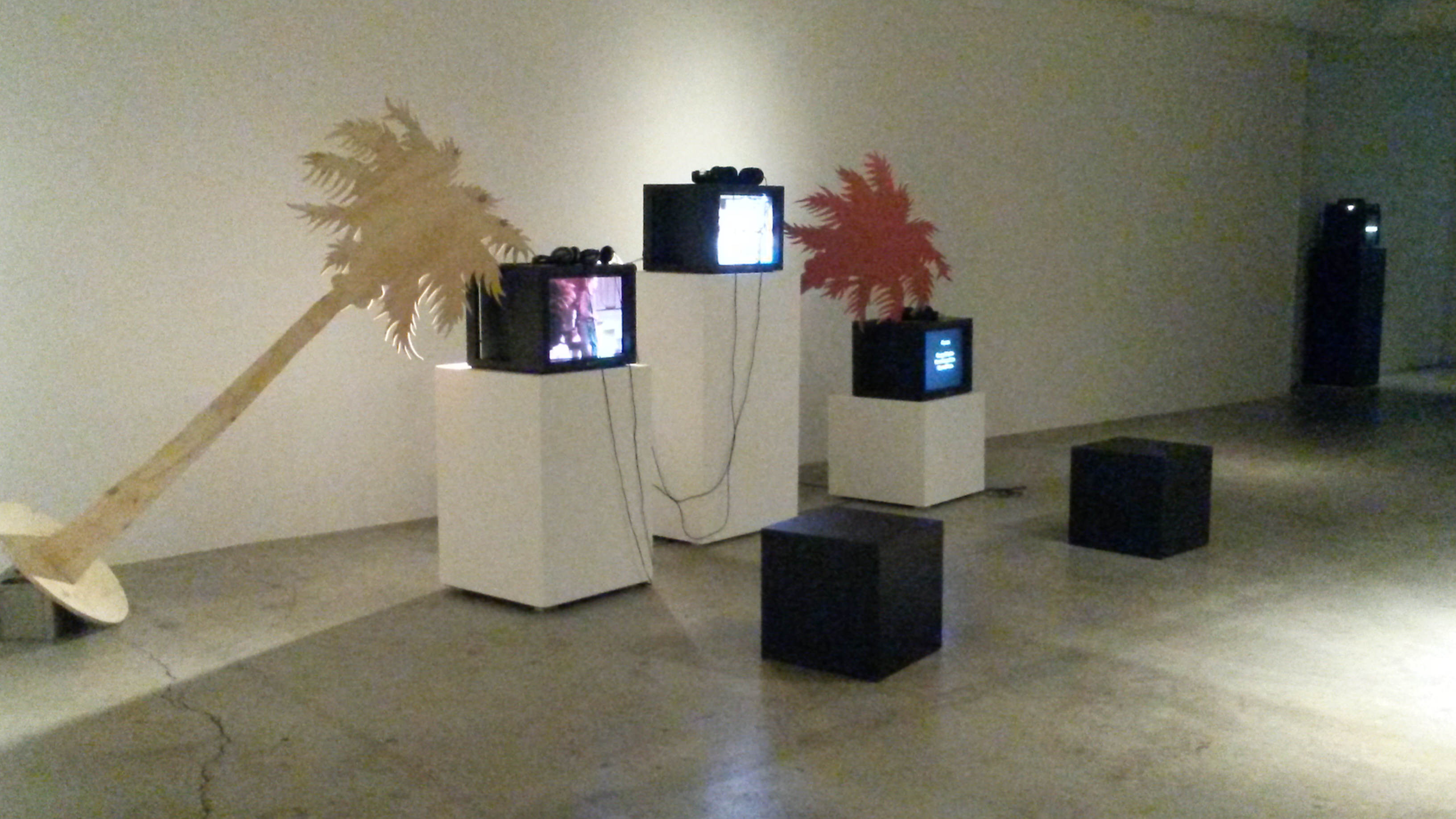
Scattered across the site are some disparate “projects.”  It’s not quite clear if the projects were commissioned for the event, curated by someone or exactly how they came to be here.  Here are a few projects I came across:

Break Room by Thrush Holmes

It’s a messy biker clubhouse made of whacked together plywood. Sitting around in the Break Room felt sort of like being inside an early Kim Dorland painting. It just needed more flourescent orange.

20141024_164248 20141024_164106 20141024_164124 20141024_164157


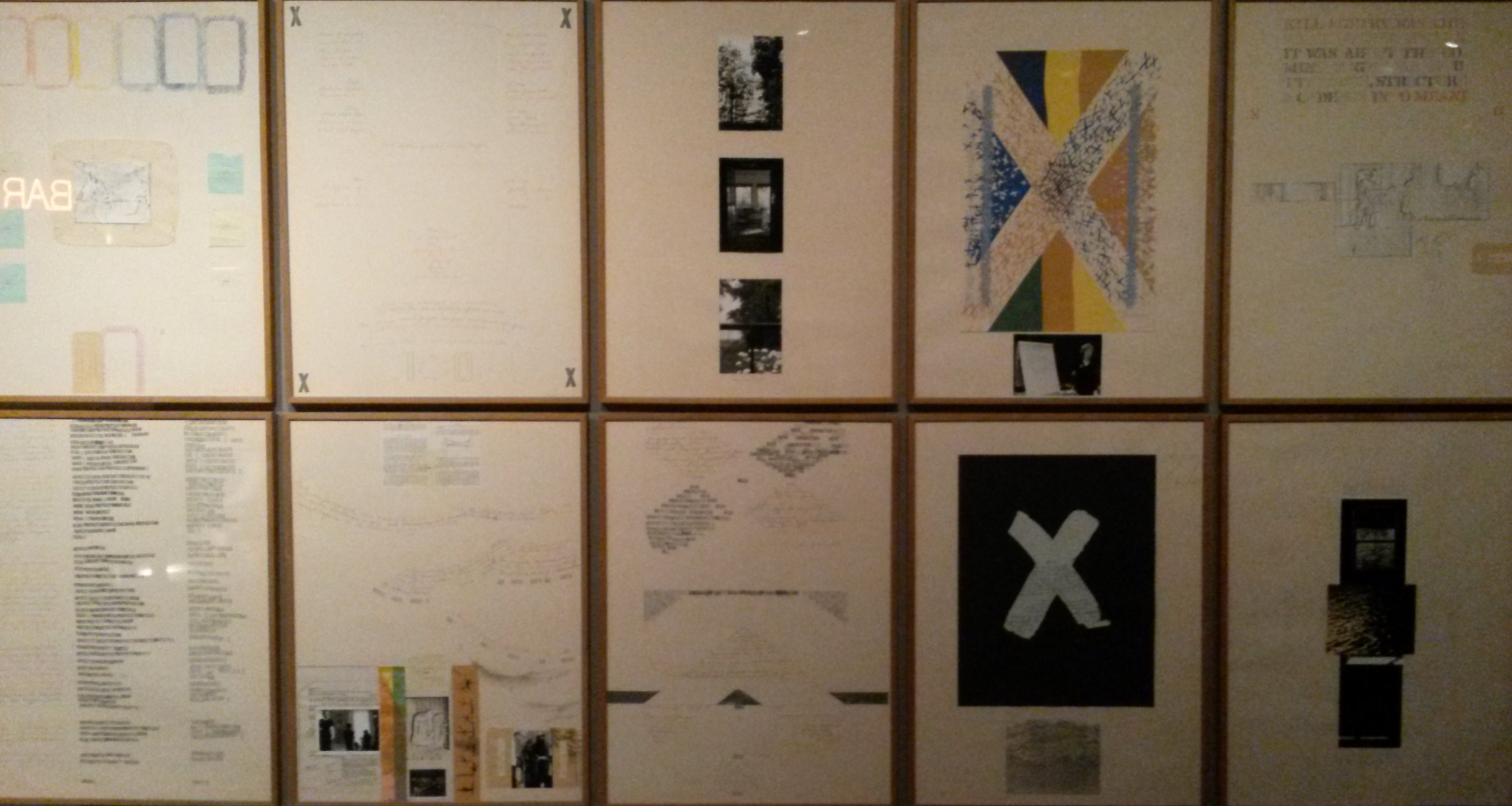
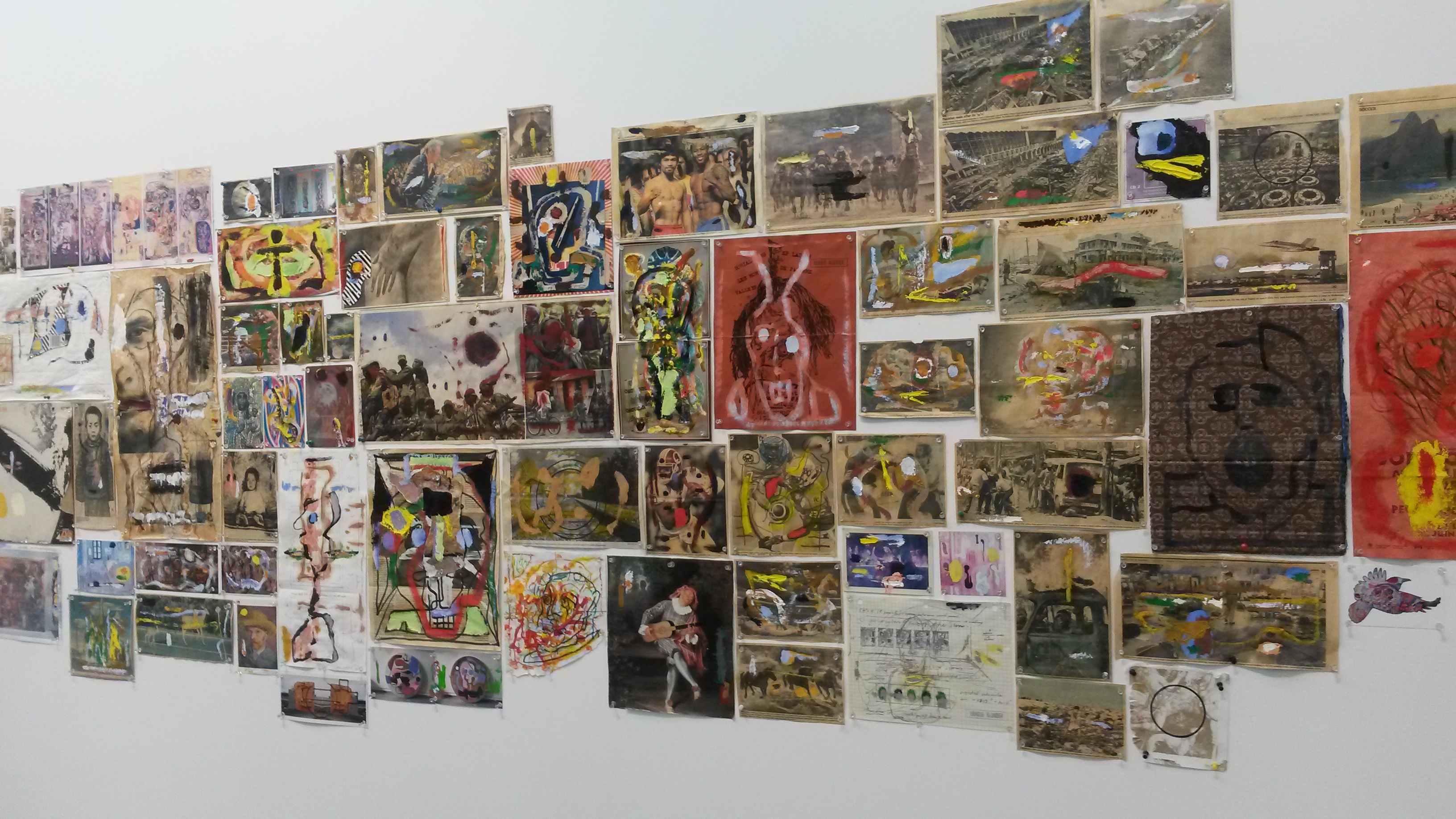
Three Pieces by Greg Curnoe

It was quite fascinating to see this long lost triptych from 1965 by the late artist Greg Curnoe. All art speaks to the specific time in which it was created. This painting screams sixties, from the trippy, posterish style to the stream of consciousness poetry.

20141024_165237

20141024_165122

Detail from Three Pieces

Here are the words stenciled, in that essential Greg Curnoe style, on the rightmost panel:

SUNDAY MORNING – JANUARY
THE COVERS – THE SUN IS OUT
THE SUNLIGHT BLUISH THROUGH
THE WHITE CURTAINS – STRIPES
OF YELLOW ON THE GREY FLOOR
THE NOISES OF THE GAS
HEATER – THE SMELL OF YOUR
HAIR – THE WHITE WALLS


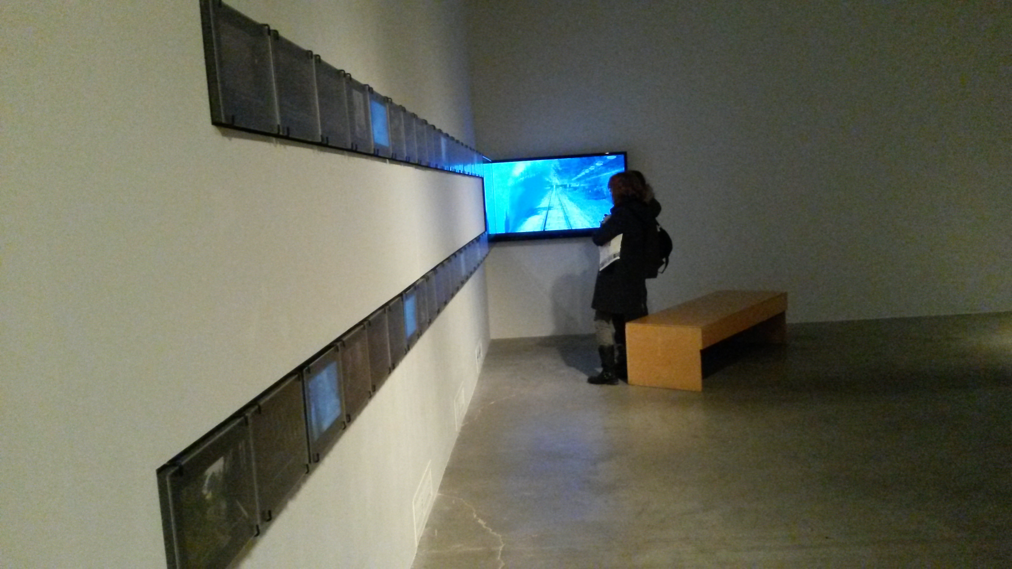
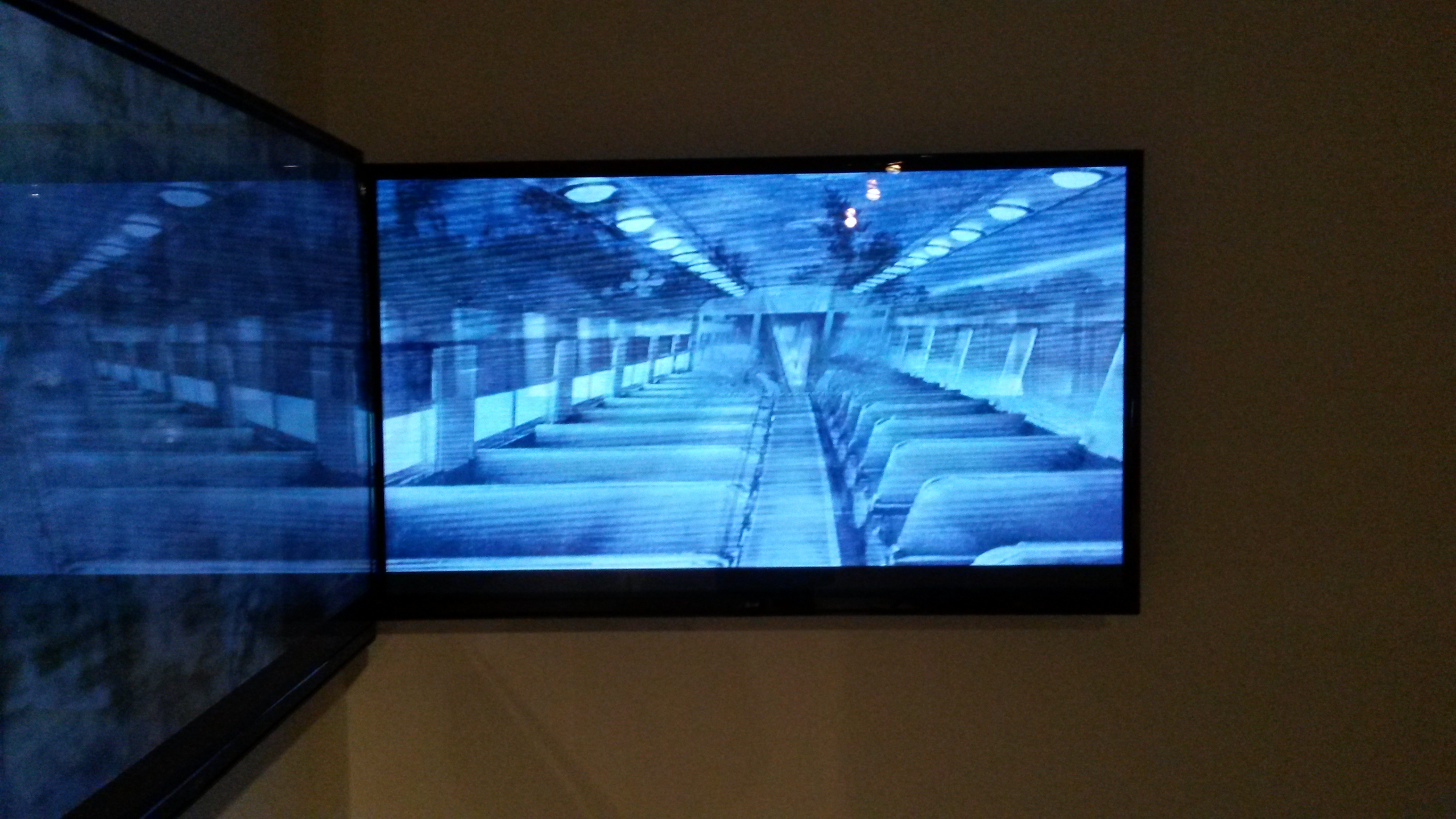
The Blind Pavillion by Jennifer Marman and Daniel Borins

I admit I have been transfixed by the paint sample arrays at RONA from time to time; or by the wonderful thick books of wallpaper samples available at the Benjamin Moore location up the street. I could make something great out of that! The artists Jennifer Marman and Daniel Borins gave in to just that type of impulse to create The Blind Pavillion. An assortment of vinyl coloured blinds is automated so that the colours flip this way and that, blinds roll up and down and different colour arrangements are visible.

20141024_190417


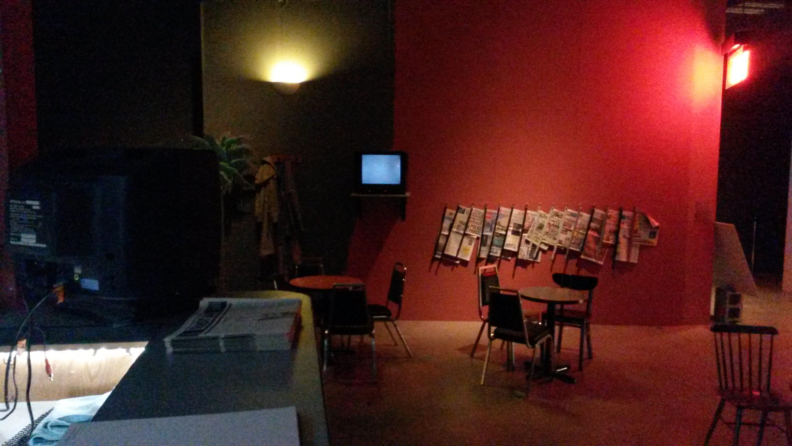
Three Minute Miracle by Amalie Atkins

I loved seeing the little white tent, the felt boots and the floor of glass beads.  This was the environment the artist created in which to view her 16 mm film, a kind of modern fairy tale about working together.

20141025_192634

3 Minute Miracle installation by Amalie Atkins


The Art Fair offered public panels both formal and informal.

I hung out in the Break Room and listened as C Magazine hosted a chat  about inter-disciplinary and cross-institutional art ecologies.  This talk highlighted the currently uneasy role of the long-term alternative arts space.

20141024_172954

Kim Simon (TWP), Amy Henderson (inter-disciplinary artist) and Amish Morrell (C Magazine)

20141025_182712

On a more “elevated platform” Canadian Art‘s David Balzer spoke to Stefan Hancherow (Curator), Elena Soboleva (Artsy) and artist Thrush Holmes about the pros and cons of “Curationism” and having someone else create your art playlist.

What about looking at art?

There are something like 4,000 objects in this massive, sprawling gathering.

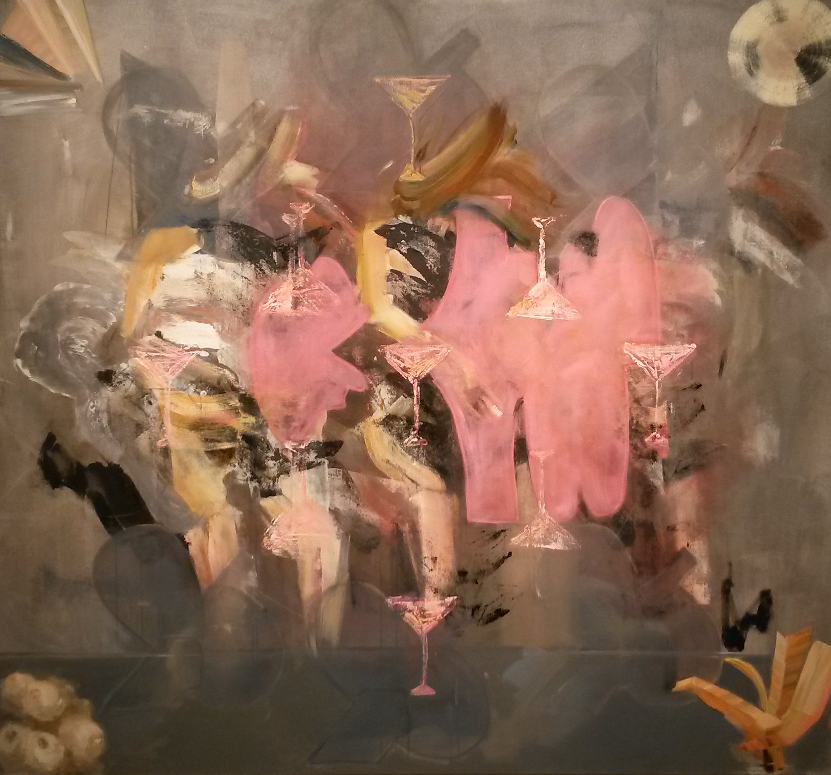
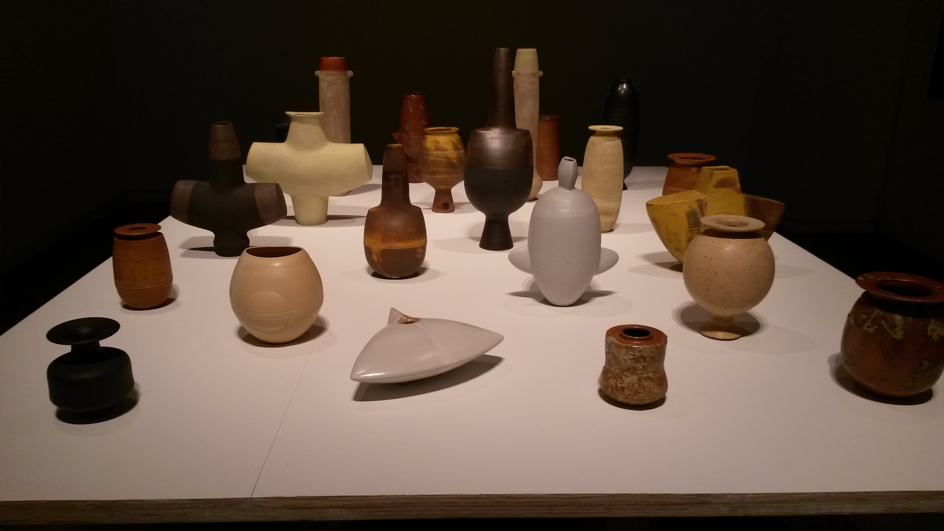
Here are few of the things that attracted me:

JP_2014_Tethered_thumb

Tethered by John Player – Pierre Francois Ouelette Art Contemporain

JP_2014_Tactical_System_thumb

Tactical System by John Player – Pierre Francois Ouelette Art Contemporain

BGL

Vielle peau by DGL – Diaz Contemporary

20141025_172942

Photograph by Sebastiao Selgado – Nicholas Metivier Gallery

20141025_170510

Detail of paintings by Ryan Foerster – Artsy

20141025_170843

Painting by Alex Cameron – Bau Xi Gallery

20141025_174106

Detail of painting by Steve Driscoll – Angell Gallery

Lynn Cohen

Photograph by Lynn Cohen – Olga Korper Gallery

large

Organic 9702 by Andrea Juan – Praxis Gallery

larger

Untitled #3 by Callum Schuster – O’Born Contemporary

larger

Banger by Angela Teng – Wil Aballe Art Projects WAAP

ron eady

Papoose by Ron Eady – AREA Gallery

jutai toonoo at Fehely Fine Arts

Artwork by Jutai Toonoo – at Fehely Fine Arts

Joy Walker

Curved Lines (After Hokusai) by Joy Walker – MKG127

20141025_192243

Detail of painting by Carol Wainio – Paul Petro Contemporary Art

20141024_161144

Painting by Doug Walker – Nicholas Metivier Gallery

There were so many things to see at the Art Toronto event.  I really liked the uncurated, raw market feel of it, where anything goes. It was fun just to be there, despite the way the vast space was made to feel claustrophobic, the lighting harsh and dinghy, the air dead and the coffee overpriced  and terrible.

It was baffling how some simple things were poorly done, for example: I took in a talk by Bisi Silva from the Center for Contemporary Art in Lagos. She showed 20 or 30 slides. It was virtually impossible for the audience to see them because the lights on stage were not turned down. The woman came all the way from Nigeria to deliver a slide lecture. Why not make sure those slides are visible?

Art Toronto may want to try to fix those problems because, as ever in the marketplace, competition has arrived.  Feature Art Fair is just a few blocks away and takes place on the very same weekend.

October 23, 2014

What did we do to deserve this beautiful, warm day drenched in honey coloured light? People were actually walking around in tank tops as I exited the streetcar on the corner of Dundas and Ossington.

Cooper Cole Gallery

Jeremy Jansen and Graham Collins have filled the Cooper Cole space with bold, urban neo-Minimalist art works.

october 23 029

 I was surprised to see references to arte provera, Germano Celant and Jannis Kounellis in the exhibition notes. Whereas the work does owe a lot to the manifestos and posturing of those Italian artists and critics of the sixties, it has been reinvigorated by these artists with a sophisticated update. The “poor” materials here are scrap metal, various found window frames and window tint polymers and the detritus of printing materials. Like the Minimalists before them these artists are overthrowing representation and symbolism to raise the truth-to-materials flag.

The painting depicted below, by Graham Collins, is made out of canvas, paint, reclaimed wood, glass and window tint

CC_Graham_Collins_Marcy II

Marcy II

The two artist’s pieces mesh well together and create a sleek and airy installation with lots of layers of glare and sheen.

CC_Graham_Collins_Jeremy_Jansen_12

The really interesting part is that on closer inspection it appears that some of the materials have been upcycled so that the work has a distinctly hand-made look to it: the welding is lumpy, the window tint is bubbled, ill-fitting and wrinkled and the wooden frames are smacked together.

CC_Jeremy_Jansen_Note to self

Note to Self (Jeremy Jansen)

CC_Jeremy_Jansen_Flag_1

Flag (Jeremy Jansen)

The aesthetic explored here is that of the cheap and hastily put together; and the materials championed are from industrial parks, DIY auto window tinting shops and down market condo sales centers. It is satisfying to see such a strong visually coherent statement emerge from all this junk.

October 18, 2014

This week I put the commercial galleries on hold and decided to check out what’s happening in the institutional realm.

Art Gallery of Ontario

What could I possibly say about Alex Colville that has not already been said?

The galleries were packed. The crowds seemed very familiar and knowledgeable about the work and its context. The pop-up gift shop was humming

.necklace

Revolver Necklace for $32 Available online from shopAGO

As I wandered through the show (for the second time!) I tried to figure out what draws people to this artist. Alex Colville’s life was shaped by the Depression, WWII and a marriage lasting seventy years. He lived in a small town. Those few facts constitute a set of experiences shared by few people living today. And yet the crowds seemed to identify and recognize something personal.

In fact, in August, when I dragged a visiting Australian relative to the AGO – a guy who was unimpressed by Niagara Falls and expressed disdain for art in general – he was transfixed by Alex Colville’s paintings. They seemed to speak directly to him. He even purchased a reproduction of Pacific, an elegantly composed painting all about dispair.

20140825_111041

Niagara Falls

GUN AND WATER

Pacific

Exacting, taut, restrained, subtle, precise: these words can all be used to describe the paintings. But within those muted tones and careful, painstaking surfaces Alex Colville planted content. Graceful young athletes and middle class pleasures are there but so too are fear, decay and death.

horse and traIN

Horse and Train

crows

Three Crows

In his rendering of the revolvers, bolting terrified horses, crows and his own bleak gaze at the relentless unfolding of life these paintings are not so much about any particular external crisis as they are about an individual’s efforts to endure.  Alex Colville addressed the human condition and his public responded.

staring gun


V-Tape

I accidently came upon an artist’s talk, by Lisa Birke, at V-Tape.

When I was in art school visiting artists gave talks almost on a daily basis.  Food and beer were provided for all, so they were well attended events.  The talks broke down into two basic categories: first, the vague, rambling, sometimes painfully awkward sessions where the speaker might say something like: “…and then I got interested in triangles…”  To me, that type of presentation was very honest and accurately reflected the artistic process, which is mostly unsure, groping and testing, interspersed with periods of incomprehensible clarity and assurance.  The other type of talk had a bit more of a sales pitch tone.  In those cases the artist forgot about the lonely, intuitive struggle to make art and just lined up a list of ideas that could be applied to the work after the fact, i.e. “…here the Hegelian Dialectic is represented as a triangle.”

I respected Lisa Birke for the dignified tone of her talk.  She gave a nod to Kant and Burke and the sublime, but she was clearly in the intuitive, groping camp.  She talked about how she made the piece: failing and trying again and being cold and frostbitten and alone in the dark early morning; being embarrassed and unsure and continuing to try and figure something out.

The result is her video entitled Red Carpet.  The piece is lovely to look at, capturing some gorgeous extremes of the Canadian landscape experience.   It also constitutes an interesting response to the Celebrity Gossip culture that seems to be taking over the world, i.e. she is in solidarity with not just the consumers but also the producers of the endless painful parade of distraction.  The red carpet leads the protagonist under water and to obliteration.  She can’t stop.  We can’t look away.

20141018_154733

20141018_145820

20141018_145912


Art Gallery of York University

I went back to the AGYU to have a closer look at the Is Toronto Burning? show.

Once I crossed the 401 there were thickets of Ford Nation signs everywhere and it rained hard.  I prayed for God to save Toronto.

20141016_170010

View out the bus window

It was luxurious to have this trove of artefacts to myself as almost no one was around.

Some of the artists are so vividly represented.  I’m still not quite sure what to make of the question “Is Toronto Burning?” but David Buchan, for example, was definitely on fire during those years.

20141016_155923

20141016_160021

He was so rakish and arch as a rat pack Lothario or Bond man or lounge act.  There are numerous videotapes of David Buchan lip-synching.  I watched him perform “Bread and Butter” (which was originally recorded by the Newbeats in 1964).  It is unforgettable.

I watched tough girl Elizabeth Chitty furiously shrugging her shoulders and whipping out her Polaroid like a lethal weapon.

20141016_155714

And I looked around a little more carefully.  Somehow at the show’s opening I missed the piece by Carol Conde and Karl Beverage in which they approximate poses from China’s Cultural Revolution ballet to spell out Art is Political.  I really like the ambition in this artwork.

20141016_144115 20141016_144125

Art is Political

Here is an image from a Chinese Ballet which was hosted by the Kennedy Center in Washington in 2011.  The caption reads:  A landlord from the ballet cowers as one of the revolutionary woman soldiers hardens her face and strikes a pose with her pistol.

ccp_ballet_0045-001M

But most of the time I spent watching Colin Campbell’s delightful videotapes.  One scene featured Colin with Ron Gabe, Tim Guest, David Buchan and Stephen Davey.  It seemed like yesterday.

October 12, 2014

There is so much excellent painting on display in Toronto right now.

This weekend I am travelling by car; chauffeured around and oblivious to any dramas on the TTC (a vague memory, until tomorrow).

Barbara Edwards Contemporary

Barbara Edwards Contemporary, on Bathurst just below Dupont, is showing the work of Ray Mead (1921-1998). This artist, one of the Painters Eleven, achieves a bell ringing clarity through his use of color in combination with spare, gestural forms.

ROMA

Roma

Untitled

Untitled

The paintings are bold, worldly and sophisticated while hinting at the psychological obsessions of the time: deep brooding complexes and anxieties burbling in a Cold War stew of dread.

october 10 008

On Saturday afternoon the painting show and various gorgeous, brilliantly colored artworks leaning against a wall looked urbane and voluptuous.  Barbara Edwards and her colleague were considering a trove of Ray Mead works and very obligingly, they opened a fat portfolio of unframed pieces for my companion and me; and one by one, tenderly plucked the vulnerable artworks from between acid free sheets to show them to us.

october 10 006october 10 009

It was a bit like reading a coded diary and trying to interpret the entries: lovely to look at, tantalizingly heavy with meaning and forever opaque.

It was surprising, on exiting the gallery, to notice a big, bold Ray Mead filling the window of the frame shop and La Parette Gallery (“art of the sixties’) across the street.  Ray Mead left his mark on Toronto.

october 10 014


Birch Contemporary

We zipped down Bathurst to Techumseh and Birch Contemporary.

Joyce Carol Oates frequently writes stories about young women who have a distorted view of the world.  They foolishly take up with sinister outcasts of one kind or another and soon things start going badly and people get hurt.  Janet Werner‘s show at Birch Contemporary, and particularly one of the paintings called Abby and Snow (which is also the title of the exhibition) made me think of the kind of struggle between the predatory and the vulnerable that Oates describes.

abby and snow

Abby and Snow

In many of these works, loosely painted figures on amorphous backgrounds, Janet Werner seems to be speaking to an individual’s misreading, rejection or distortion of society’s norms or expectations.  She explores the blurred boundaries between cute and grotesque, assertive and repellent, demure and … um…dead, to spectacular effect.

Sunday (racoon eyes)

Sunday (racoon eyes)

Walker

Walker

Ballerina

Ballerina

I was particularly fascinated by Janet Werner’s take on enduring female archetypes: ingenue, pretty ballerina, horsey type, bimbo.  Her representations of these typically hackneyed clichés are riveting.

The current chatter around feminism and Beyonce, for example, becomes pale and superficial in contrast to these disturbing images encompassing profound female yearning, disappointment and pain.

Georgia Scherman Projects

Next door to Birch is Georgia Scherman Projects and an exhibition of paintings by Melanie Authier.

There is something about these paintings that makes them entirely of the moment.  Maybe its because we expect more from abstract painting now than ever before.  If Ray Mead was venturing into unknown territory in the fifties at this point it is well travelled terrain.  Melanie Authier uses the daring elements employed by a painter such as Ray Mead and combines them with references to all kinds of artistic romanticism from the past.  I was reminded of Turner’s deep, mystical space; my friend observed the nod to Casper David Freiderich’s majestic cliffs.  The work also has a connection to the current look of video game animation, the so-called “fantasy art” created by modelers to give gamers a daunting landscape in which to search and destroy.  These big, ambitious paintings package it all into something new.

2014Rake-n-Snake

Rake-N-Snake

2014Iron Belly

Iron Belly

The show entitled Figments and Foils includes a number of small watercolours.  These pieces have the same sumptuousness, technical and spatial virtuosity as the larger works but they also have a freshness and spontaneity that is very appealing.

2014WOP-Assembly

WOP-Assembly

October 8, 2014

Hart House

Nestled in the U of T campus, just off University Circle, is Hart House, a student activity center which contains a gym and the Justina M. Barnicke Gallery, among other facilities.

John G. Hampton, the curator of the current exhibition at Hart House, titled “Why Can’t Minimal,” for some reason decided to illuminate the lighter side of the Sixties art movement known as Minimalism. (Incidently, when searching for a good Minimalism site I stumbled upon a whole new meaning of the term. Yes, there is, in fact, a second type of Minimalism: it’s an entirely contemporary social movement which advises people on how to get rid of the excess stuff in their lives in order to make room for the essentials.)

Carl Andre, Donald Judd, Sol LeWitt, Dan Flavin, Frank Stella (for his minimalist Black Paintings) are a few of the artists associated with Minimalism. Carl Andre, the ultimate American Minimalist sculptor, likes to say “It’s all the materials… there are no ideas hidden under those plates. You can lift them up but there is nothing there.” No hidden ideas and therefore nothing funny… about zinc plates or a pile of bricks or massive oak cubes.

Rather than actually finding the humour in Minimalism what the curator did was round up some Conceptual artists who commented on utterly humourless Minimalist standards. The result has a particular off-key, dry wit (verging on absurdity) so close to the heart of the Conceptual artist.

Some of the works in this show are delightful: John Boyle-Singfield’s Untitled (Coke Zero) references the Hans Haacke Condensation Cube of 1962, replacing water with Coke Zero. The Coke Zero does create condensation but it has also undergone a gross transformation, breaking down into its elemental components: On top, an evil looking red liquid and below, a suspicious powdery substance.

coke zero

Ken Nicol created Carl Andre Drawer Piece and got into the spirit of “truth to materials” by typing the Carl Andre quote “If a thing is worth doing once, it’s worth doing again” on 1611 index cards.

File piece

I always associate John Baldessari with Cal Arts and a particular brand of flat humour that came out of that school. In his video Baldessari “sings” each of Sol LeWitt’s 35 “Sentences on Conceptual Art” to the tune of popular songs. It must have been Christmas when he made this video because the tune sounds distinctly like a holiday carol.

JB

There is a certain slyness to John Marriott’s various sized cubes surfaced with pigeon-proofing strips. They also achieve a cool elegance in an incidental, i.e. Minimalist, manner.

See below for an installation view and a close up of the pigeon-proofing strips.

cube and spikesspikes


University of Toronto Art Center (UTAC)

A few steps from Hart House is UTAC and an exhibition of the photographs of Allen Ginsberg (1926-1997) called “We are Continually Exposed to the Flashbulb of Death.” This is a fascinating show for anyone with an interest in the Beat Generation.

A recording of Allen Ginsberg reading his 1955 poem “Howl” can be heard throughout the gallery’s rooms.

20141008_155630

It is, of course, primarily as a poet that Allen Ginsberg is known. These photographs however attest to his skill as a photographer (he was mentored in this ability by Robert Frank) and moreover they document a life profoundly rich in relationships, friendships and experiences.

Below, William Burroughs in 1953:

20141008_155046

20141008_155745

Gregory Corso, Paul Bowles and Burroughs in 1961.

From Gary Snyder, Peter Orlovsky, Jack Kerouac and Paul Bowles to Kathy Acker, Rene Ricard, and Michael McLure the pictures in this show depict so many of the literary and intellectual luminaries of the past four of five decades. Each picture includes a description, hand-written by Allen Ginsberg, identifying the subject, the date, the place and the circumstances.

20141008_160458 20141008_155945  20141008_16042220141008_160300

An essay by Louis Kaplan in the exhibition catalogue quotes Ginsberg as follows: “The poignancy of the photograph comes from looking back to a fleeting moment in a floating world.” Captured here in black and white, the humble New York diners and living rooms of the fifties have disappeared forever. This show provides a glimpse of this vanished world and its inhabitants.