In a modest residential neighbourhood, only a few steps from the Bloor Value Village, lie more western outposts of sophisticated art. Clint Roenisch Gallery and Daniel Faria Gallery both have spacious storefronts on Saint Helens Avenue. Client Roenisch arrived in July and Daniel Faria has been there for three years. Tucked around the corner in an alley off Dublin Street, is the mysterious Scrap Metal Gallery, unfortunately closed on the day I visited.
It was grey and cold and sleet was present.
Harold Klunder at Clint Roenisch Gallery
In the foyer of the RBC Center on Simcoe and Wellington, near the Starbucks, is a large Harold Klunder, which I passed daily, for about three years, on my way to the elevator banks. The artwork has an eighties neo-expressionist or so-called “bad painting” look. As I recall, the paint is thick, chunky impasto of yellow, orange, browns and blacks with a certain gnarled chockablock geometry that I identify with the artist. I had assumed I would see variations of this work at the new gallery on Saint Helens Avenue.
In this show, however, titled Live by the Sun, Love by the Moon, Harold Klunder’s work has moved away from the static heaviness of the RBC painting into a realm of light, air and expansiveness that was very exciting to see.

Green Abstraction
There is some explanatory text on the gallery wall which mentions Harold Klunder’s Dutch heritage and his connection to the Dutch artists of the past. I liked looking for these links. The bewitching light of Vermeer is successfully evident, particularly in a painting called Airmail Blue #1. (As someone with a European parent this painting had an emotional component too, recalling childhood in which the exquisitely thin blue airmails from abroad connoted a distant and romantic world.)

Airmail Blue #1
There is a massive triptych on display titled Flemish Proverb which made me think of Dutch tapestries (such as the Hunt of the Unicorn which hangs in the New York Cloisters) because of the scale, complexity, and ambition of the work and the way it reads as an illustration of some arcane narrative. Each panel is painted with a unique palette and iconography yet they are unified by a sense of cascading from light to dark vertically, as horizontally a tale unfolds.


Flemish Proverb and detail of the same painting
A large painting called This Length of Muddy Road seems to shift its identity from map to narrative to landscape and it somehow manages to be filled with light and air despite the grey background.

This Length of Muddy Road
In some of the paintings the use of color is truly startling. I was fortunate to attend the Willem De Kooning retrospective at the Museum of Modern Art a few years ago and I can see why the exhibition notes cite that artist as one of Harold Klunder’s (Dutch) influences, particularly because of his use of color.

Milk of the Sun
The show is put together in an interesting and unusual way in that a selection of the artist’s source material is exhibited with the paintings.
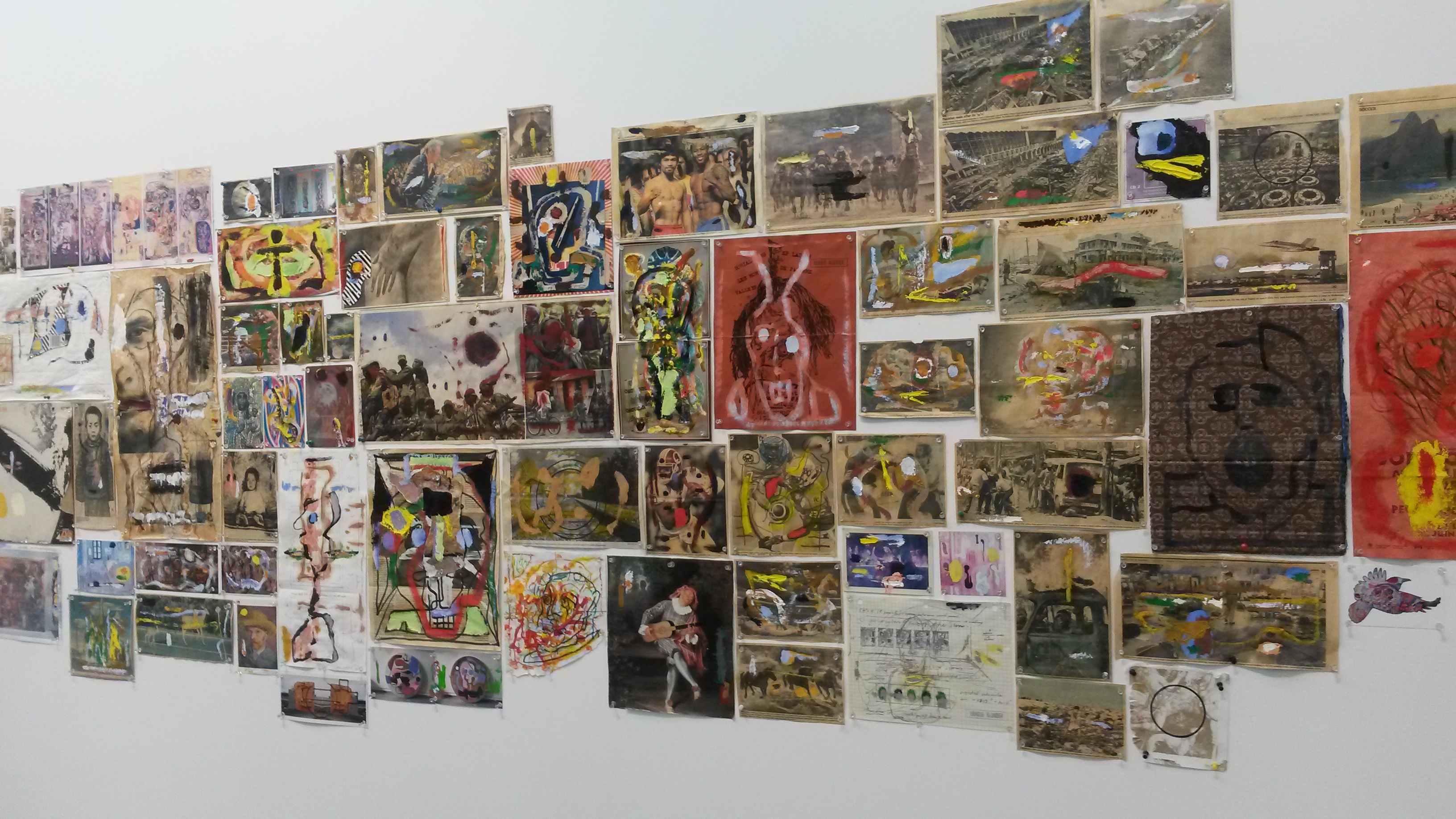
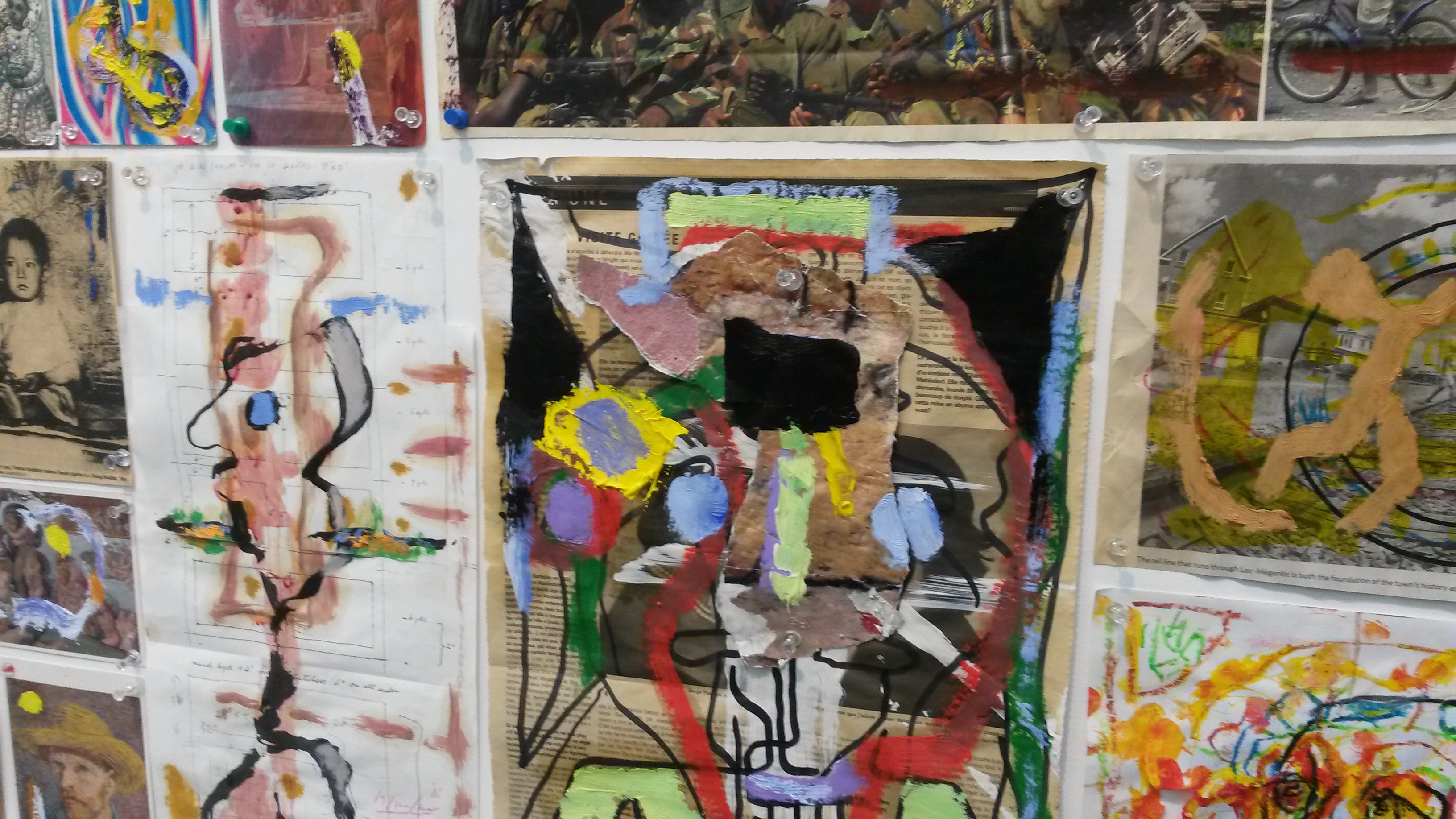
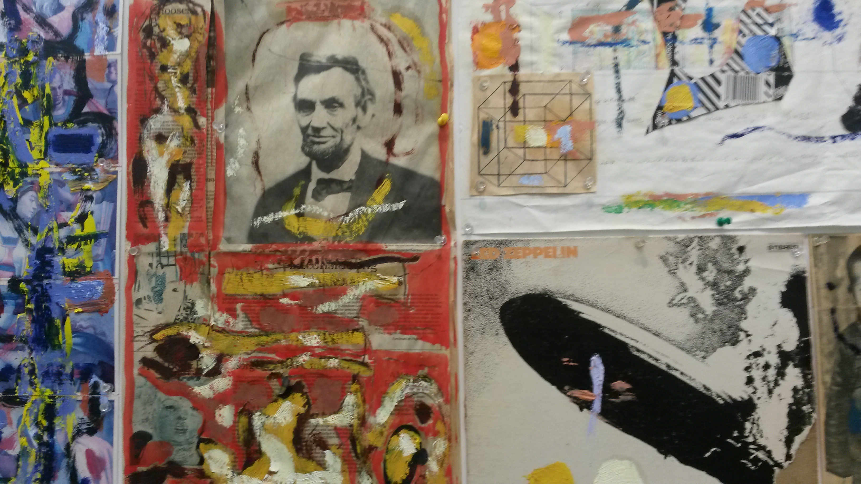
The collage of paint dabbed news clippings and magazine scraps is really fun to look at. A grouping of vivid water colors hint at the artist’s process regarding color.
Also included in the exhibition is a welded metal sculpture (borrowed from the collection of Harold Klunder) created by a now deceased French-Canadian nun called Soeur Marie-Anastasie.

At first I thought it was influenced by Picasso.

But no…it looks more like a Harold Klunder.
Daniel Faria Gallery – Kristine Moran, Wayne Ngan
At first sight Kristine Moran’s paintings made me think of Melanie Authier’s work (written about on this blog in the October 12 post) because of the way a mass of abstract iconography is piled up in the middle of the canvas while the corners remain relatively empty, and because of a similar palette both women use.
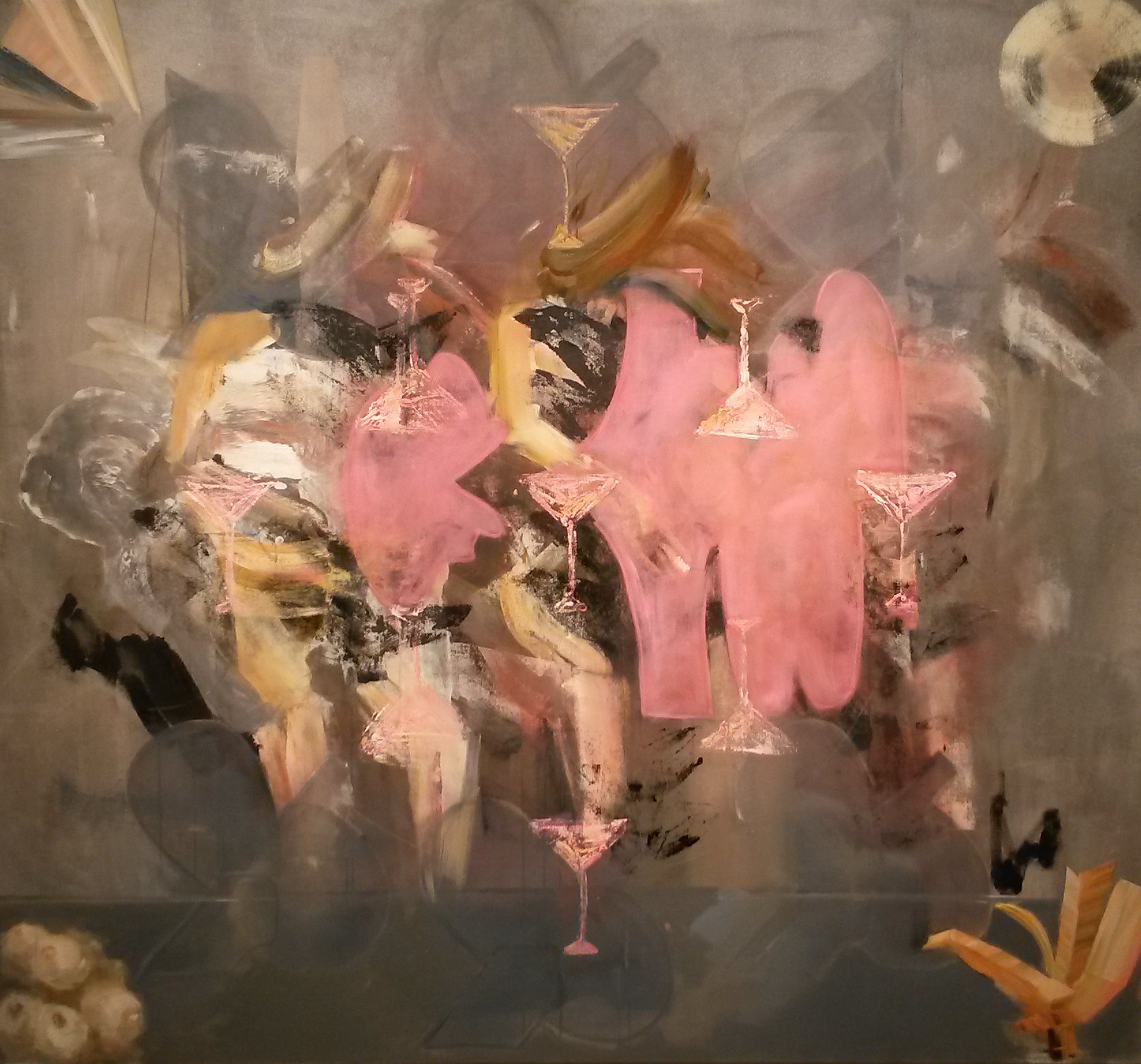
But soon the distinctive and exuberant aesthetic of Kristine Moran, who has shown her work with Daniel Faria for six years, comes into focus. Whereas she too explores the manufacture of deep space on canvas her gestural marks are raw and gritty and sometimes combine with explosive force in this show, called Affairs and Ceremonies.

Funeral Procession
Formerly a figurative painter Kristine Moran has developed a personal language of various mysterious forms which appear repeatedly as she creates an expressive whole from layers of jumbled narrative.
She can’t quite leave figurative painting behind however: vestiges of arms and legs, martini glasses, armour or shields, odd items like tank tops, candles, flowers, open books; all find their way into her paintings.
Flashe

Seance

I liked the fact that Kristine Moran is not afraid to attach Cosmo type titles to her paintings (Gossip or Affair for instance) and for some reason I thought of lingerie colours – pink, black and champagne – when trying to get a read on her paintings. Is this a woman who is using the trappings of the female life as she seeks to understand and evolve through art?
On the afternoon I dropped into the gallery there was an opening party scheduled for later that same day.

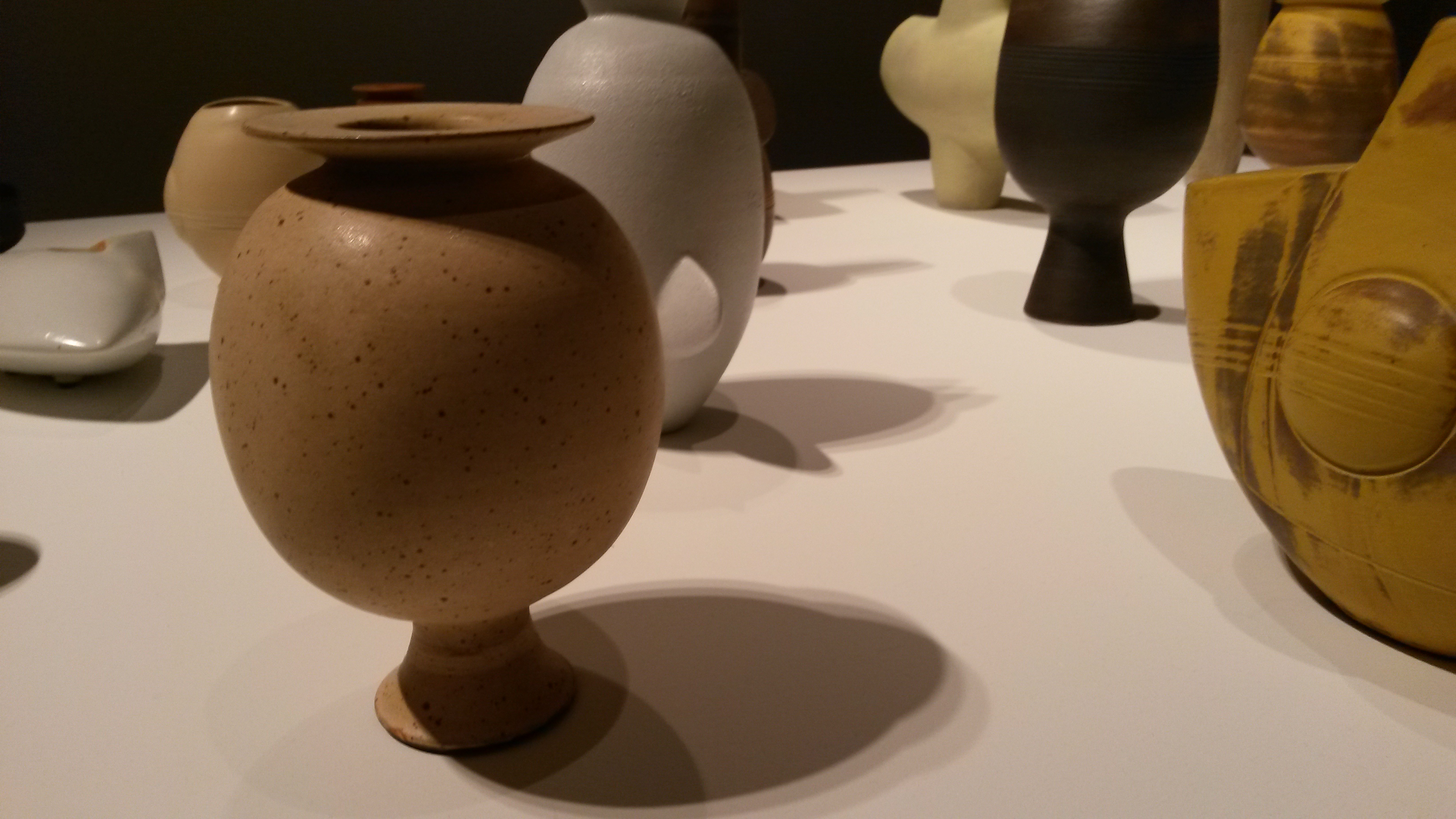
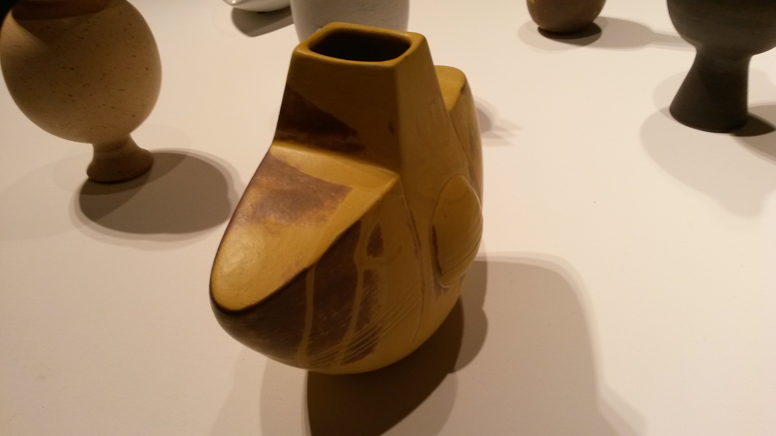
The spectacle of all that beer in such close proximity to a collection of new works by Wayne Gnan gave me an uneasy feeling. I sincerely hoped there would be no regrettable incidences as the opening played out.
These beautiful objects are arrayed precisely on a tabletop and lit with drama.
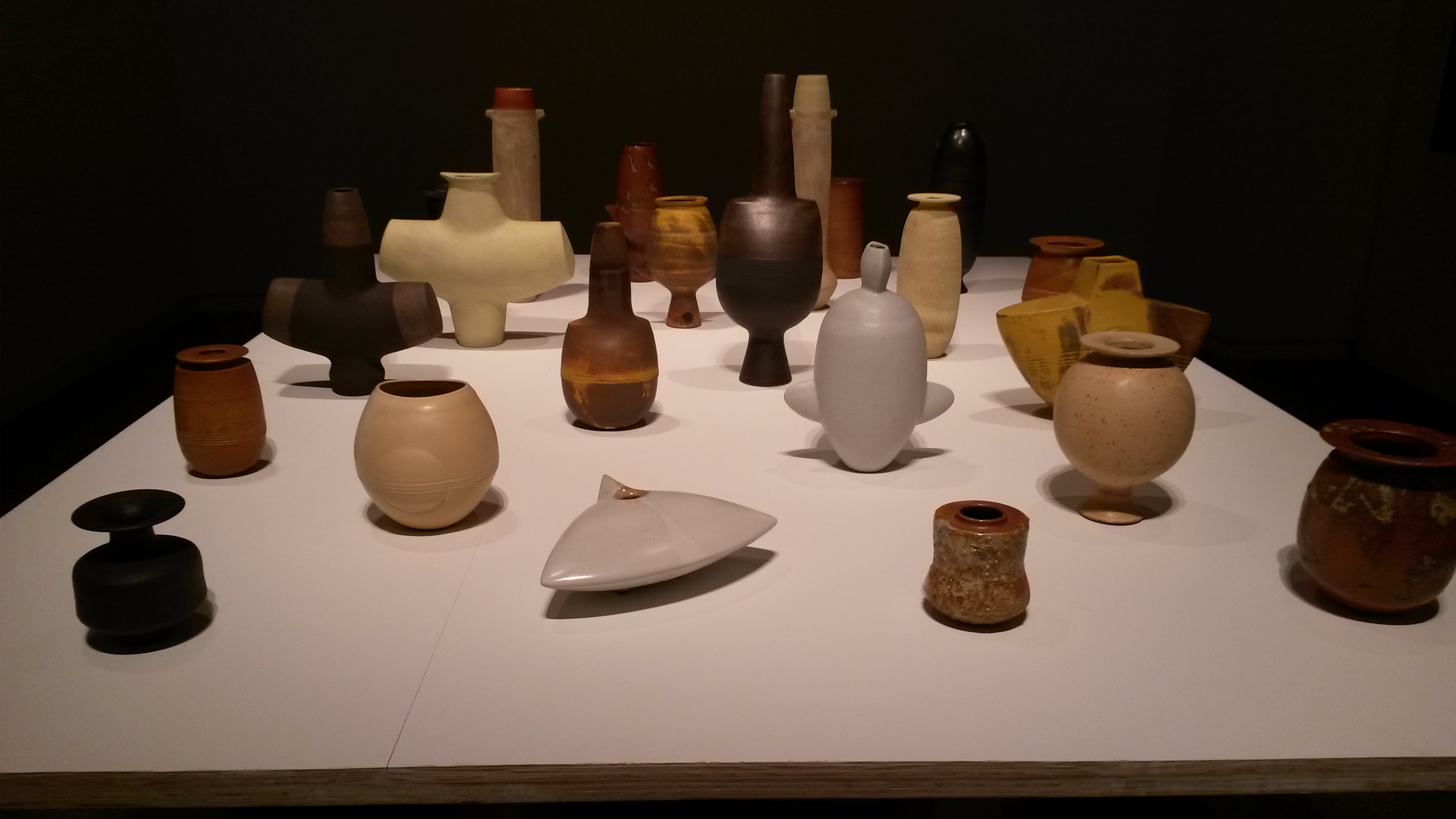
The installation works as a whole. The strong, weighty forms, soft, natural colors and perfectly subtle sheen are entirely harmonious. It is also rewarding to spend time looking at the inventive sculptural integrity of each individual piece.